A heat map is a map that uses color or some other features to show an additional dimension, for instance a weather map depicting bands of temperature.
Good for: describing high-low patterns and interactions, as well as trends over time.
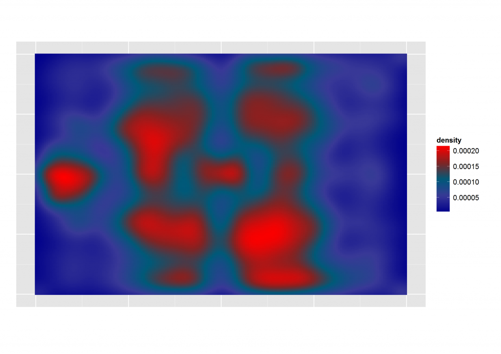
Heat have become very popular as part of the science behind sport analysis.
In this example we can see the pattern described by the playing style of a football team. This types of maps can help a manager in different ways by assessing the behavior of the team given different circumstances: injuries of key players and home or away matches are some examples.
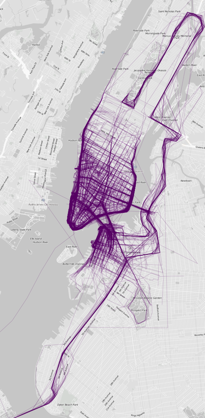
Another good example is this map that shows us the preferred zones for runners in NY:
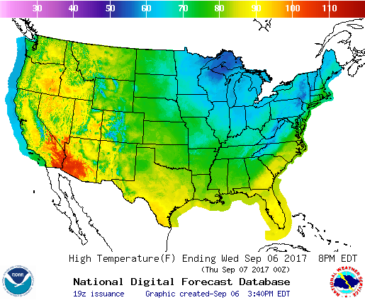
Of course heat maps have been widely used by countries weather services to depict the climate in a given territory:
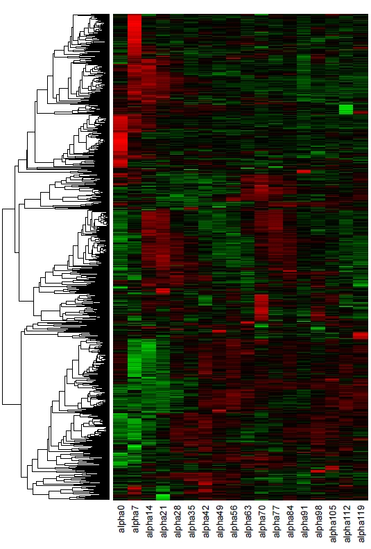
Cons: when used in tables, heat maps can be easy to misread:
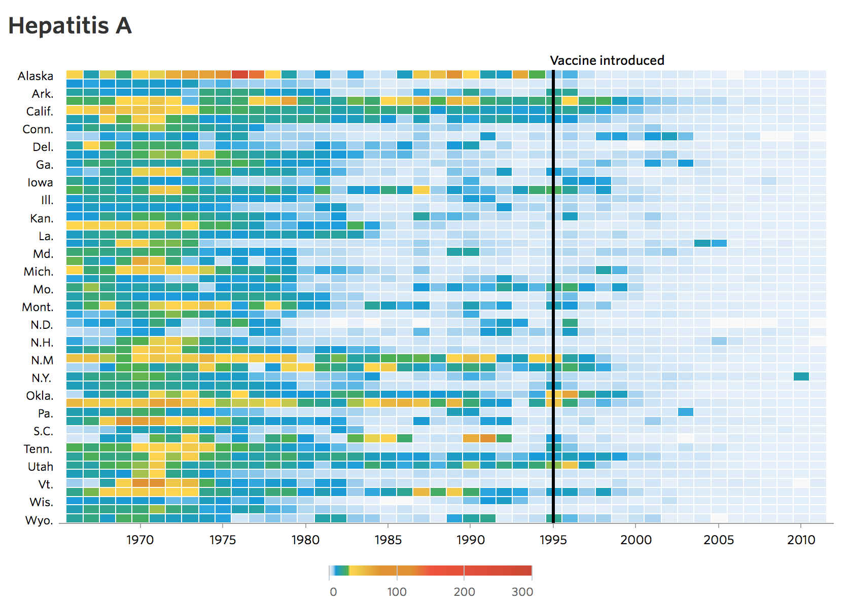
Even well documented heat maps can be difficult to read when using multiple elements. In the following example, we can se a decline in the number of infected with Hepatitis A in a span of 70 years. After the vaccine was introduced, the map becomes clearer and easy to identify, however, before the vaccine was introduced, it can get somewhat complicated to read:
Conclusions:
- heat maps are a wonderful tool to identify patterns and behaviors.
- they work better when used in a map.