Image, Interpretation, and Interface Write-Up
Ryan Best
In Image, Interpretation, and Interface, the first chapter of Graphesis, Johanna Drucker offers a broad-sweeping introduction to the origin, history, and development of “visual epistemology”; in layman’s terms, how graphic and visual work has developed core structures, standards, and principles that aid their use in providing interpretation or analysis across a wide range of disciplines. Drucker also focuses on explaining graphics in the context of a well established “language of graphics” metaphor. This metaphor grounds the chapter's conversation on how thought leaders established and expanded formal articulations and consensus regarding graphical representation of knowledge in a way that allowed for fluency across eras, professions, and disciplines – in a similar fashion to how rules of grammar and syntax allow for fluency across speakers of a common language - and how this metaphor has been used by thought leaders to communicate these findings to a broader audience.
Most interesting to me in this chapter is how there continued to be an emphasis on standardization and reproducibility in approaches to graphics throughout their development – so much so that even formalized principles rooted in psychology concerning how visual forms produce predicable effects in their audience (Gestalt principles) were defined – and the limitations that coincide with these systematic approaches across times and cultures. Many aspects of these foundations of graphic design – how we communicate and interpret information through visual mediums – have become ubiquitous enough that they can be taken for granted today, and this common understanding allowed for the constant development of new ideas and expansion of this medium into processes that were not inherently visual. It is this aspect of studying how visual communication has evolved over time that most interests me; how standardization and reproducibility has lessened the amount of cognitive lift required to understand and interpret visual representations of knowledge, and how this push towards so-called “graphic formalism” to establish universal repeatable principles of visual forms can add credence and “an air of authority” to the topics being covered (p.34).
Armin Hofmann
In this vein, I chose to investigate the work of Armin Hofmann, who is mentioned on page 38 – “…Armin Hofmann wrote texts that outlined ‘principles of graphic communication’ and elaborated tenants of formal visualization as compositional principles (size, scale, movement, order, symmetry, asymmetry, etc.)”.
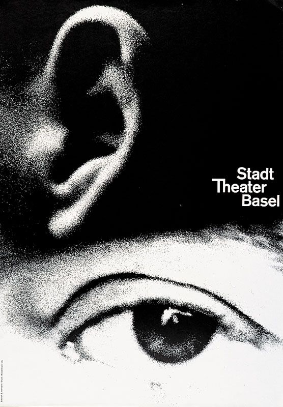
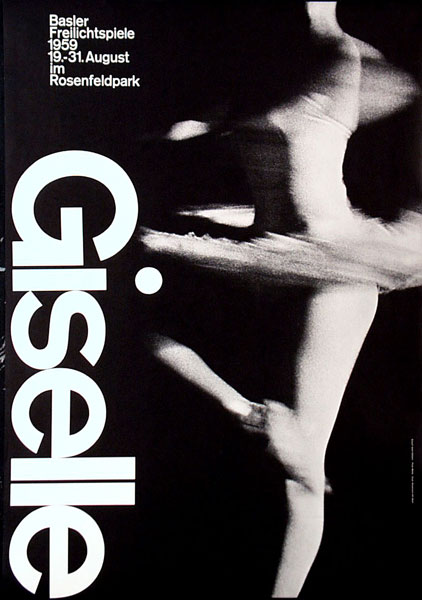
Hofmann, a Swiss designer and professor at the Basel School of Design, approached graphic design from a purely rational and methodical standpoint. Hofmann and the Swiss International Style of design, to which he and his students contributed heavily, sought to establish universal tendencies and styles within design, optimized for communication without sacrificing beauty or aesthetic merit. His book Graphic Design Manual, which outlines these philosphies, has maintained its place as a pivotal resource to designers today in the digital age, expanding past mediums primarily employed by Hofmann at its inception. Hofmann believed in the poster as the most efficient form of communication, and the posters he designed for cultural clients (especially the Basel Stadt Theatre) showcase his purity, simplicity, and elegance in design. This emphasis on clear, reproducible communication of information, knowledge, and feeling in a visual format has truly stood the test of time, and is something that strongly resounds with me.
Poster Designs
 "In a theater poster, he interprets the dramatic experience of watching and listening with mesmerizingly large and grainy photos of an ear and eye, amplifying the impact by reducing the visual idea to its essential components."


Sources: