Scatter plots chart unique data points on the x and y axes. They are incredibly versatile and allow users to quickly discern patterns, correlations, relationships, and outliers in large data sets. The flexibility of scatter plots allow for as much or as little pre-processing as needed, as architects can chart aggregates against aggregates, or simply plot the relationship of raw data points. Scatter plots struggle (or are at least not the ideal medium) to compare aggregate measures across multiple different groups of data.
Example 1: NYT's Scatterplot to Find Good School in Affordable Housing Markets
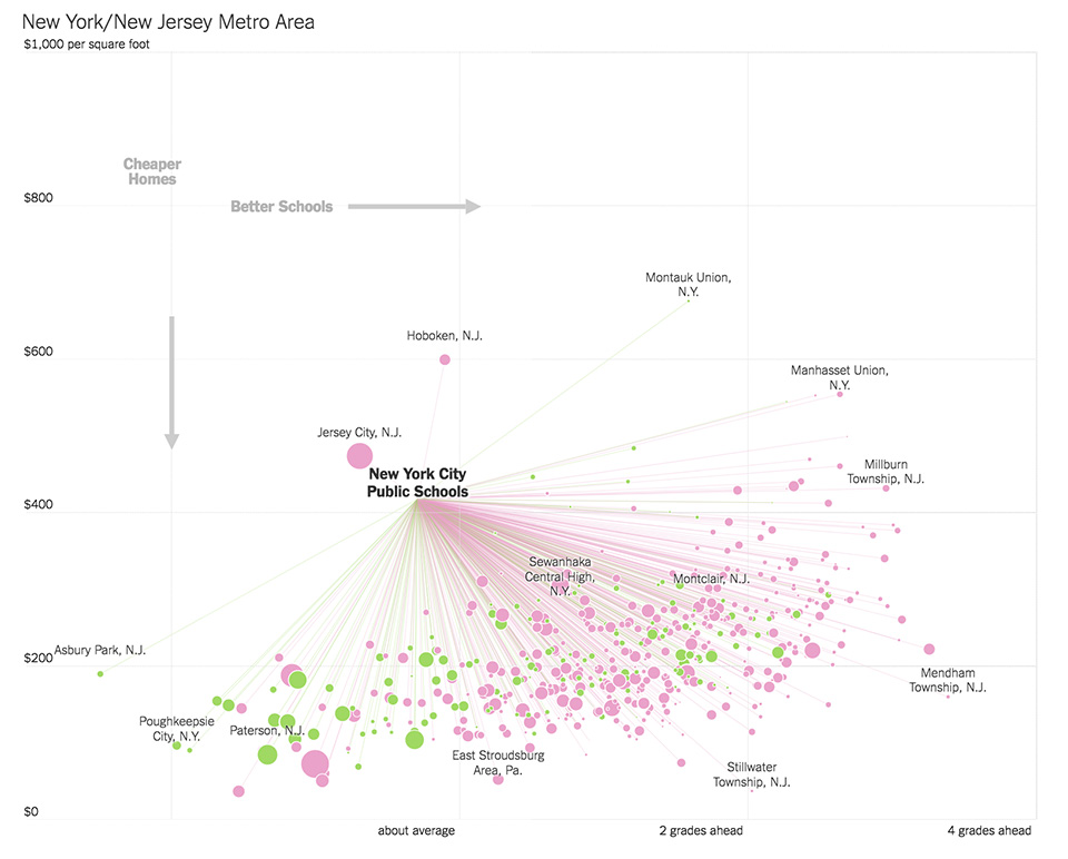 In plotting performance of school districts against price per square foot in housing, this chart is effective in displaying the relationship between these variables in different markets, along with identifying "higher performing" cities. Anchoring users to a benchmark district is helpful in making comparisons, and while connecting lines, color, and size all add explanatory information, these can potentially bombard and confound the user.
Example 2: NBA Rotated Scatter Plot
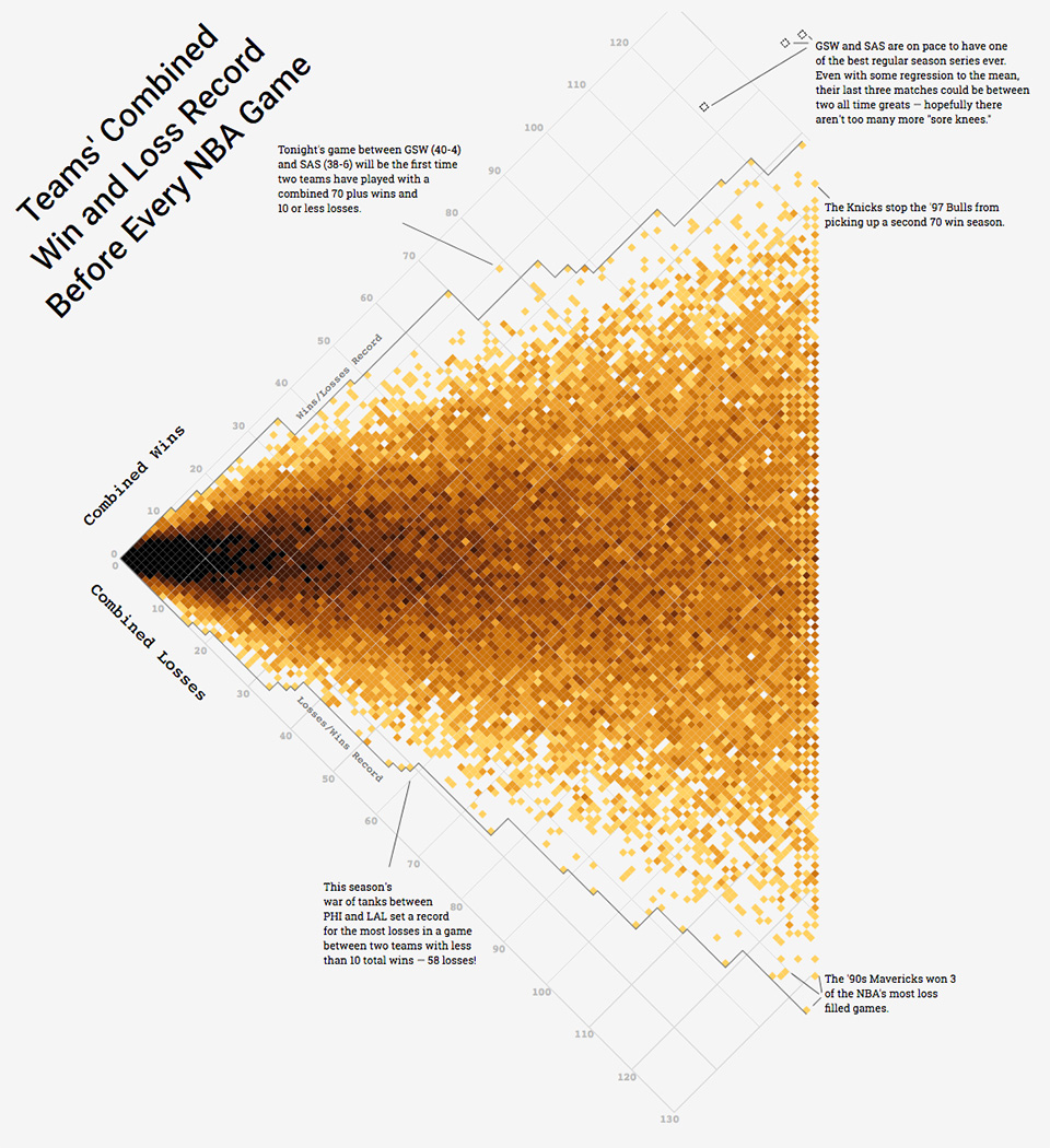 This chart plots combined wins and losses of a matchup to identify outliers of historically 'good' and 'bad' matchups.
Example 3: Plotting USA's Microbreweries
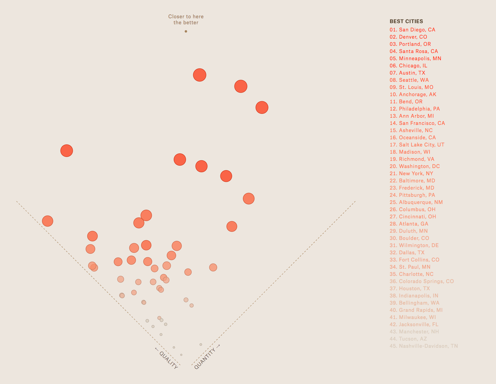 Plotting author-defined metrics of "quality" versus "quantity" of microbreweries in cities across the United States. Sizing of each point on this chart add aesthetic appeal more than additional analytical insights.
Example 4: Physician's annual compensation versus gender wage gap by state
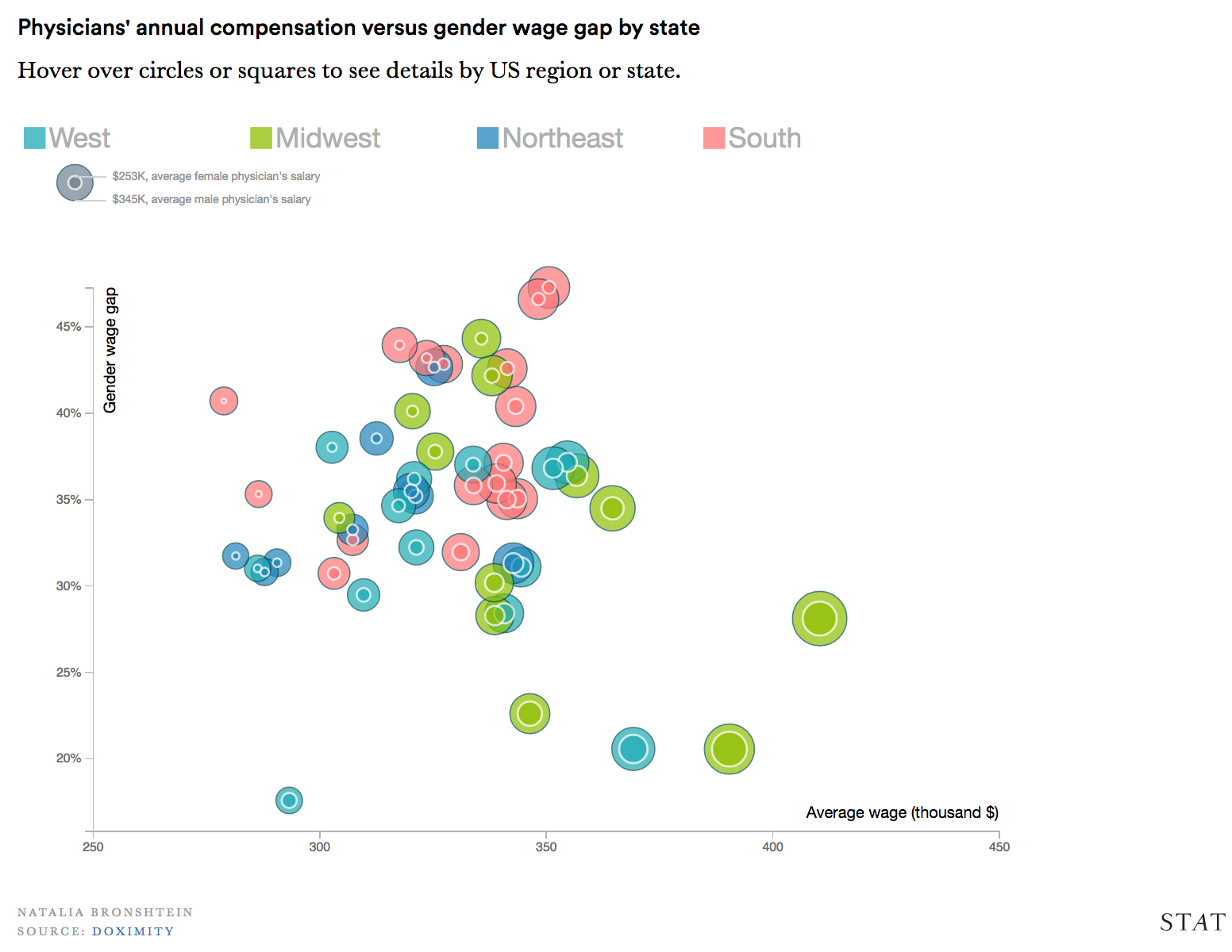 This chart represents wage gap in seemingly two ways, which may conflict and confuse the user. Additionally, the coloring of these bubbles doesn't offer a concise story line (is that an inherently negative aspect of the chart's design?)