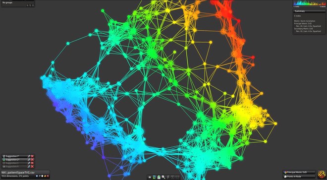
Both “tree" and “graph” models can be considered broad categories of types of representations.
A "tree" diagram hierarchically order data connected by lines of branches. Nodes representing individual data points are connected by branches. Sub-sets of this type of graph would include Dendrographs, probability trees, and decision flow charts, among many others.
A "graph" is a tree that has less order, which can connect back to itself (nodes connecting back to other nodes in the flow of the diagram). This type of representation is especially prevalent in the realm of computer science, where many points of data may be connected in a network, in which individual nodes don't necessarily represent the end of a branch. Variations in the color and width of connecting lines can indicate the level or quality of relation between nodes.
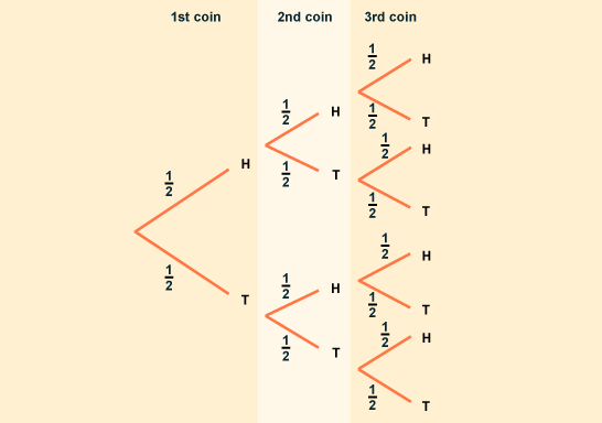
On the simplest level, as provided in this BBC page explaining concepts of probability to student, a tree diagram is used to show the two branchings (heads/tails) that result from every flip of a coin.
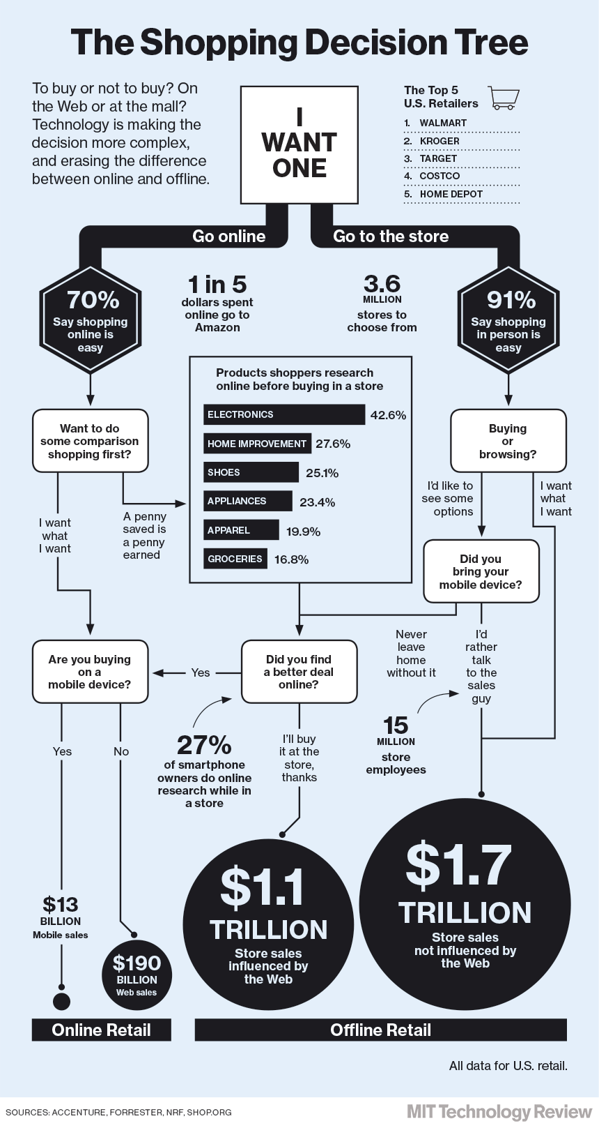
A common example found on the web is a "decision tree" graphic. These types of images are usually highly subjective rather than based on hard data sets, but a good (if simplified) example is provided here by the MIT Technology review, demonstrating the way that online shopping and internet technology was influencing consumer spending patterns in December 13, 2003.
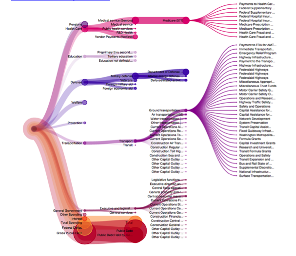
Perhaps the best example of a tree graph that I found was a visualization of the 2013 Federal Budget. This screenshot, taken from a fully interactive site that they developed which allows users to hover and drill down into information nodes, showcases the use of both color and branch size as carrier of meaning. Colors give the viewer a sense, at a glance, of the relative size of each type of expenditure (education, military), and the size of the branch indicates the amount of dollars given within each field. Branches split and drill down further to give information on specific programs within government agencies.
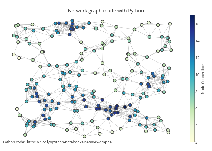
The following example is a graph model of a network, constructed in python. While simple in form (merely a set of circles and lines repeating and connecting), the use of color as an indicator of the number of node connections gives another dimension on which to easily read the information.
Similarly, Iris, a data-visualization tool featured in Wired Magazine, will plot abstract data sets as graph models while using additional color coding to give further dimension to the data.
