I was very excited by the last two sections of the chapter discussing the constructed nature of data and thereby it's visualizations. In my mind the question of a humanistic approach to data viz must reflect the fuzzy nature of our senses and the reality we construct. Appealing to a viewer's imagination, how they picture abstract content and attempting to replicate something that reflects the natural means of computation and virtualization we all possess. I've often thought about what a phone UI would look like if it weren't bound to the screen size and resolution. If this extension of our intellect and communicative ability was accessible in an organic alternative. If the needs of graphic differentiation between two subjects didn't need to be explicit but was intuited through some other means.
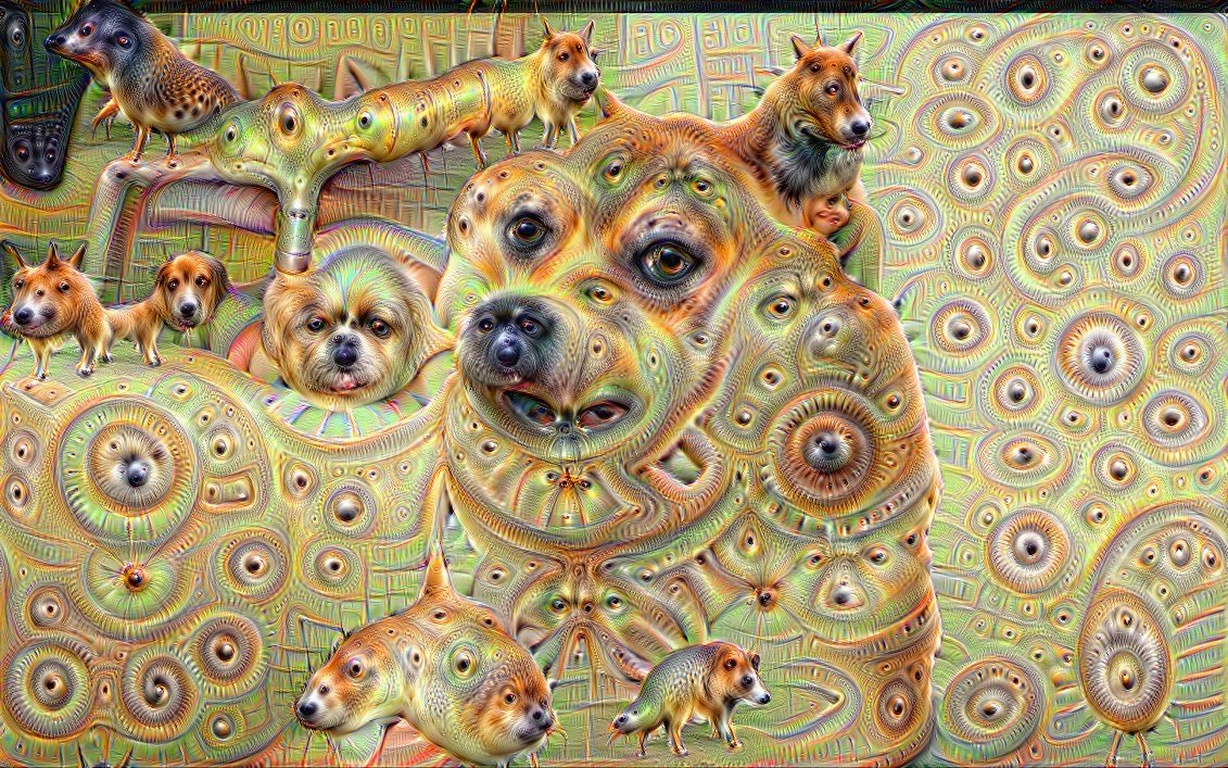
The images of the amalgamated real estate photos and productions of Google's DeepMind understanding of what a dog or a house looked like swirl about my head. A visual representation of uncertainty.

I wonder too if by incorporating the user themselves to define graphically the elements of a visualization, through association and freehand drawing, could we assemble a final product, made in part by the user themselves that introduces the concept of the fragility of what is being presented. It's ability to be distorted or skewed not only by the data but by the audience themselves.
As Flavio pointed out in his presentation on Giorgia Lupi, there's a line to walk between embellishing a visualization with flourishes that can further draw in the user, or distract and upset the objectivity of a data point. I think the same holds true if transferred to the idea of appealing to the minds eye, producing graphics that feel organic and familiar at the expense of pinpoint accuracy.