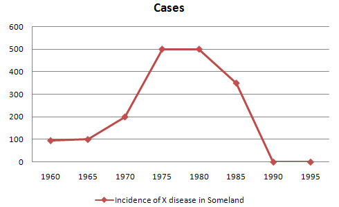
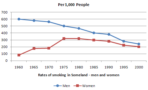
line graph: a series of points connected by lines
also known as a line chart: A line graph is a type of chart used to visualize the value of something over time.
Defintion Line graphs compare two variables. Each variable is plotted along an axis . A line graph has a vertical axis and a horizontal axis. So, for example, if you wanted to graph the height of a ball after you have thrown it, you could put time along the horizontal, or x-axis, and height along the vertical, or y-axis.
When to use a line graph:
Distributions of data over time: trends
Continuous data
Line graphs are generally not our best option for:
Close comparisons of data
Representing individual values
How to Create a Line Graph
- Create a table.
- Draw the x- and y-axes on the page. ...
- Label each axis.
- If time is one of the factors, it should go along the horizontal (x) axis.
- The other numeric values measured should be placed along the vertical (y) axis.
- Each axis should be labeled with the name of the numeric system as well as the measurements being used.
- Divide each axis evenly into applicable increments.
- Add data. Data points are plotted and connected by a line in a "dot-to-dot" fashion.
- Data for a line graph is usually contained in a two-column table corresponding to the x- and y-axes.
- Create a key.
- Title graph.
MORE: Most line graphs only deal with positive number values, so these axes typically intersect near the bottom of the y-axis and the left end of the x-axis. The point at which the axes intersect is always (0, 0). Each axis is labeled with a data type. For example, the x-axis could be days, weeks, quarters, or years, while the y-axis shows revenue in dollars.
Data points are plotted and connected by a line in a "dot-to-dot" fashion.
The x-axis is also called the independent axis because its values do not depend on anything. For example, time is always placed on the x-axis since it continues to move forward regardless of anything else. The y-axis is also called the dependent axis because its values depend on those of the x-axis: at this time, the company had this much money.
More than one line may be plotted in the same axis as a form of comparison.
Examples:
the good
title/key/x and y axis labeled

color as key indicator creates clear comparison between data sets

the not so good
no clear trend or change, title or key
