These are both a set of bar plots that can be independently sorted. They are an improvement upon the traditional bar plot since the sorting allows explicit visualization of an additional dimension of data.
An example of a permutation matrix is:

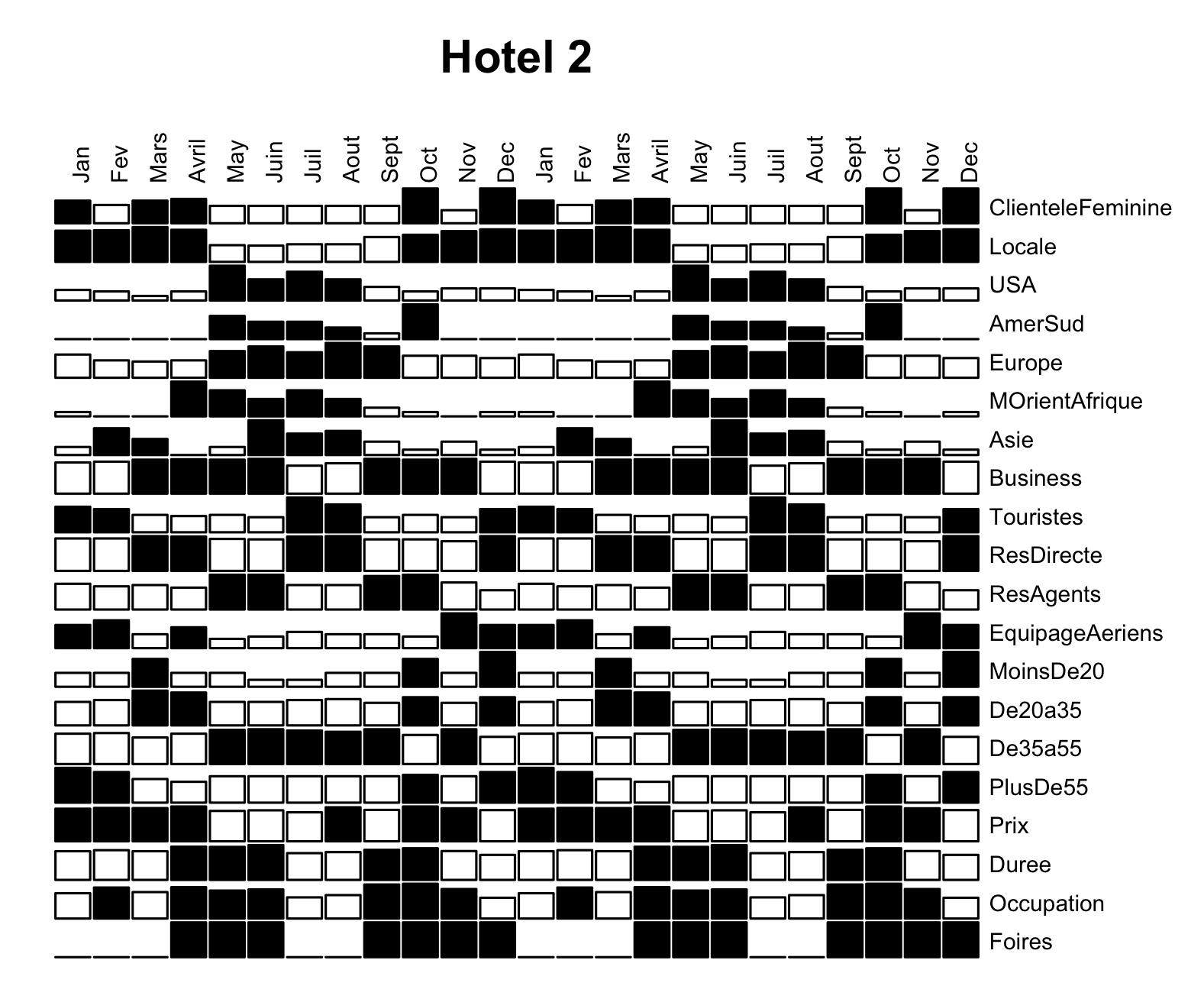
Here, in each cell of the matrix, there is a bar that visually displays the count of guests at "Hotel 2" that align with a given attribute during a particular month over the course of two years. Bars of a count greater than a certain threshold are shaded black. For example, the first (top left) cell, displays the number of Female guests in January and is shaded because that number is greater than the pre-decided threshold.
The columns, displaying the months, are ordered in the standard temporal way, which allows us to view cyclical patterns in the data across each year. As mentioned, we can permute these columns, perhaps putting identical months (of different years) together to more directly compare those; this is what permutation matrices allow us to do. Similarly the rows are permuted in such a way that we can make significant comparisons -- age group categories, guest geographic origin, reason for hotel stay, etc. are next to each other.
Numerical data is visualized using size, shading (color), and relative position in space, too, because the choice of permutation allows us to visualize certain patterns we may be interested in.
An example of a survey plot is:

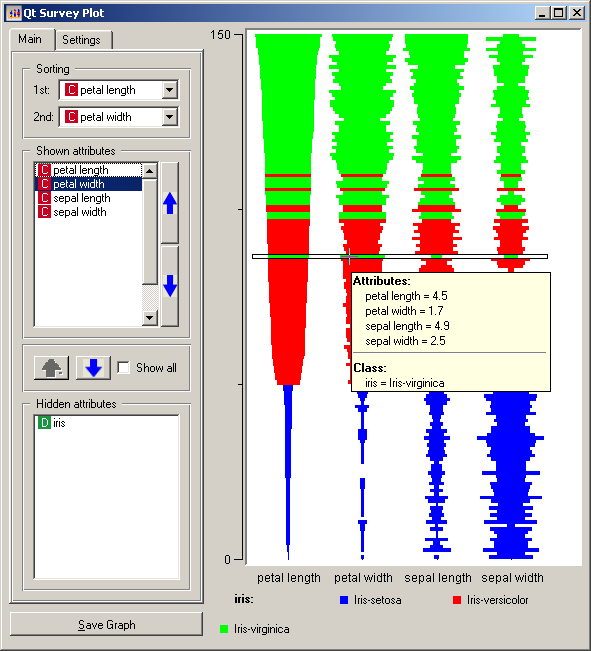
This is essentially the same idea as a permutation matrix. Various bar graphs are stacked on top of each other, and we can arrange the order of these graphs as we wish. Again, numerical data is visualized using size, color, and relative position in space. Color splits up different species of flowers, and the size of the bars display the numerical size of each flower attribute.