Overview:
One of science's most ambitious projects started mid last century. Practitioners wanted to create a single model of the universe. This transformation of the "Grand Unification Theory" into the "Theory of Everything" has proved illusive. To this day, scientists evince a greater capacity to formalize new models than to create a single formalization applicable to all phenomena. Does this lack of achievement in any way suggest that the original problem articulation or utility are in any way diminished in value? No. Similarly, this is where Graphesis excels. Unfortunately this is also where the two inquiries diverge, but more on that later.
Drucker asserts rightly that her readers are deluged with a "ubiquity of graphical formats". Of these, there is a subdomain that creates rhetorical arguments and/or convey knowledge. Although we can all interact with these instances, our interactions are largely founded on cultural intuition. This is so because the visual form is regarded with "skepticism" and "distrust" by industry and science for the ambiguity of the visual.
The net effect is that, to the degree that they encode a rhetorical argument, their function has been rendered invisible largely, but not always, due to some path-dependency and/or other urgent cultural, industrial, or scientific requirement.
This needs to change yesterday. We have to create a new unified way to critique and understand visual arguments. Moreover, this process needs to be done as consciously, conscientiously, and with the same cultural import as similar processes using words or numbers. Unless this is done, we will continue to stagnate in the existing domain-specific partial solutions elaborated on in this chapter.
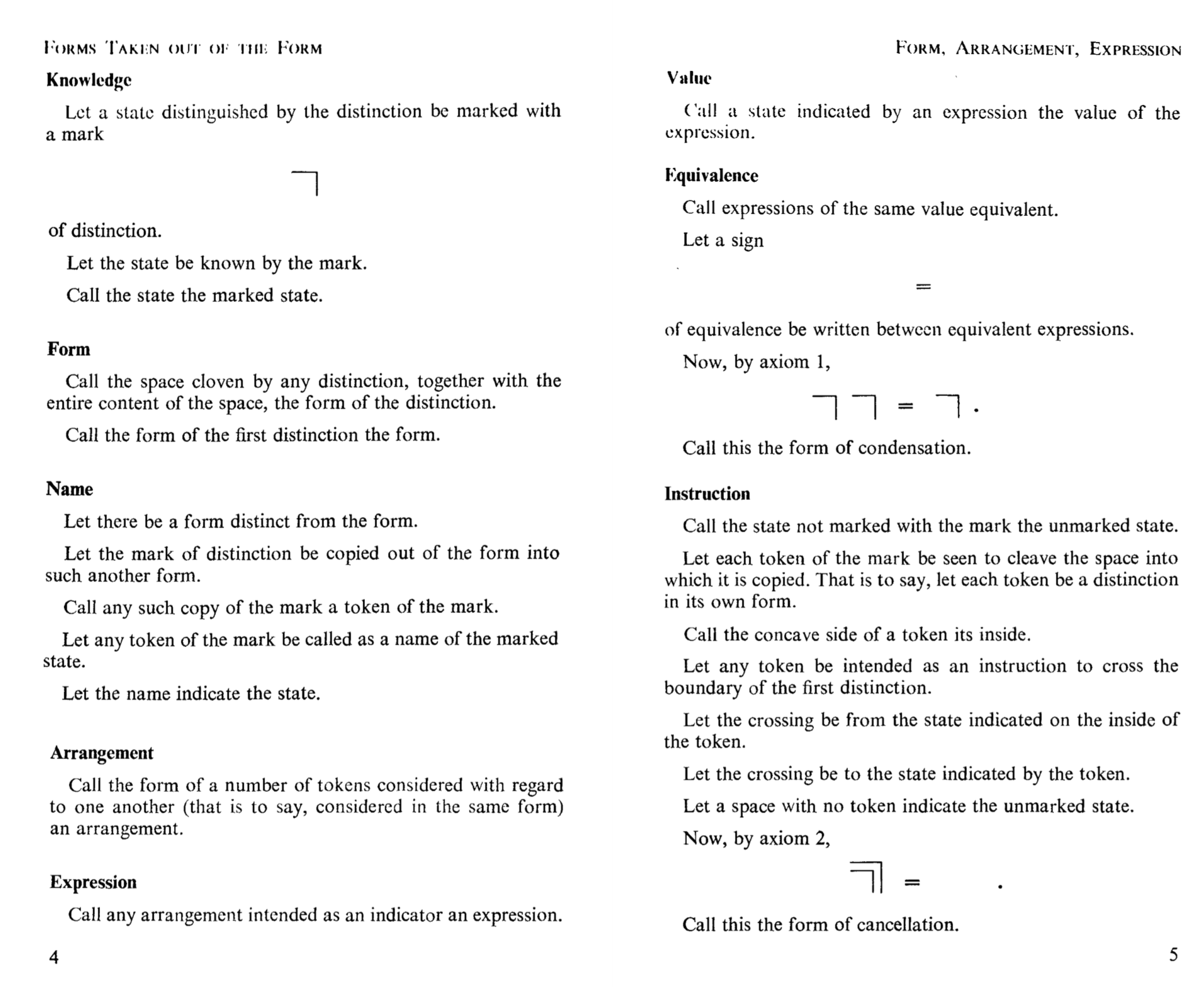
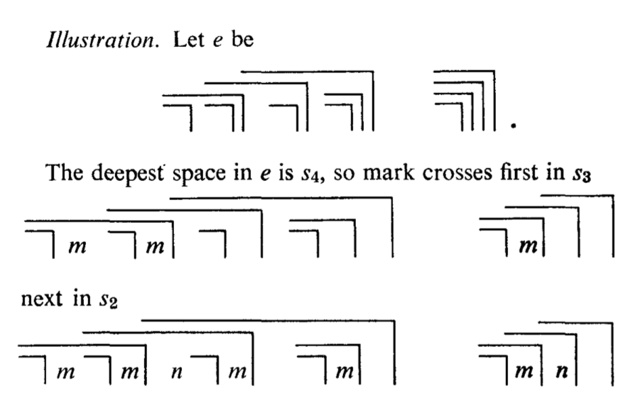
As a preface to the exhaustive list of historical examples, Drucker outlines the qualities she expects such a formalism would possess (pp20). Her endgame as expressed here is then not only be a set of formalisms for understanding visual rhetoric but also a clarification of how they would be applicable to "humanistic problems of interpretation".
Thoughts:
The goal articulated, we can return to my example in the first paragraph. Similar goals have been expressed in several domains of human endeavor throughout the centuries. I am not aware of one that has actually succeeded without any major caveats. To a degree, the success of these sorts of projects is irrelevant. The critiques, formalisms, and directions that they generate have value regardless of whether the end goal, as initially expressed, is actually achieved.
That said, I found Drucker's goals, when they implied going beyond critique and formalization, unclear and at times, lacking in scope.
She asserts unambiguously that we need to create a visual epistemology and that she will use visual approaches to knowledge production as the foundation for her theoretical and methodological foundation. Other times she seems to state that the goal is a formalism of meaning producing graphic forms (pp17 2nd ph 2nd sentence) . While I would support the latter, the former is contextually problematic and to be clear a formalized ability to create and critique visual rhetoric does not constitute a knowledge-producing epistemology.
Throughout the first chapter Drucker repeated the truism that semiotics is contingent on and co-constitutive with its embedded culture. Drawing from her examples, I would expect that any project whose goal is to articulate and formalize a new domain of knowledge production might open with an academically rigorous salvo of precedents. While her tone is hardly conversational, it was not clear how the deluge of examples formed an effective narrative argument. While almost always interesting, her path seemed winding and unconvincingly inductive.
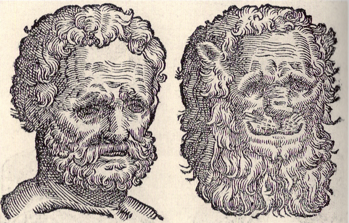
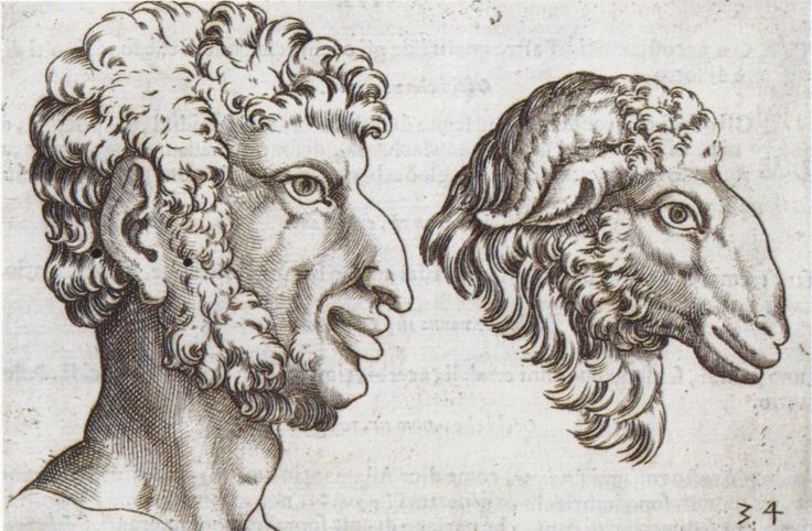
On this point, the vast majority of her examples were eurocentric. As Drucker would surely attest, there are different ways of encoding knowledge. Her choice of precedents here seems to imply that she is content with re-committing the historical sins of the sciences and humanities. Or perhaps, in the best case, she can pursue this goal strictly for eurocentric ends, and let other cultures adapt such work later. Either way, history suggests it won't end well.
Work:
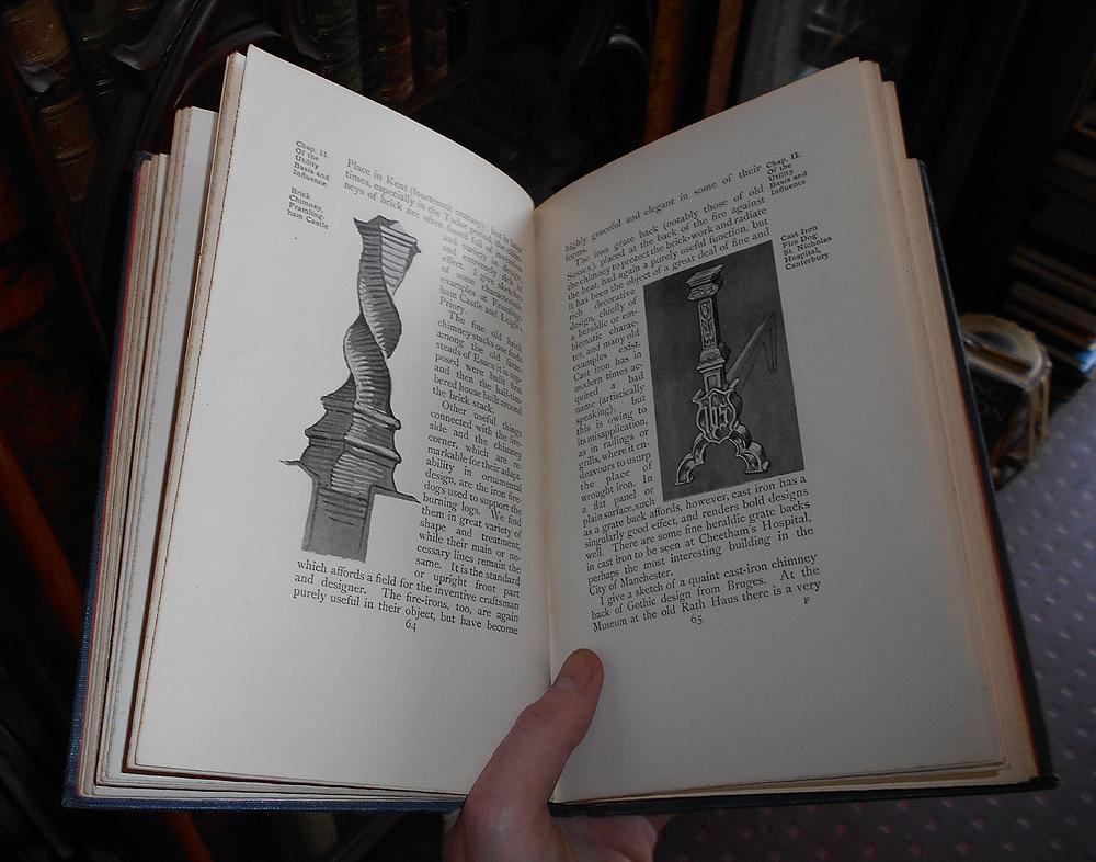
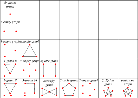
When I first read this chapter over the summer I was able to relate most to her examples that drew from my work as a coder. That said, in the countless openframeworks or processing examples which I have made for my students and in the equally numerous finals and midterms they would submit, I never quite regarded them so consciously as a visual rhetoric. This is an idea I find fascinating and hope to continue developing.
From the website Processing styles itself as an open source, "software sketchbook", that allows anyone to create interactive 2d and 3d works more easily than using using various frameworks directly.


Questions:
From the last page of the preface she asserts it is possible to: "encode knowledge as interpretation" While not orthogonal, these activities seem separate enough that I can't parse the meaning here.
In all examples I could find independent of the book, a visual epistemology has more to do with embedding knowledge in graphic forms. What is an example where knowledge is produced by these forms?
Why would she focus on the applicability to "humanistic interpretation"? Would she say a formalism has already been produced for science and industry?
With regards to "the right tool for the right job", what if math is more generalizable because of (arguably) the lesser degree to which it owes its utility to cultural interpretation? The follow on here is that visual forms will never enjoy the same formalism since they are highly dependent on the culture in which they exist?


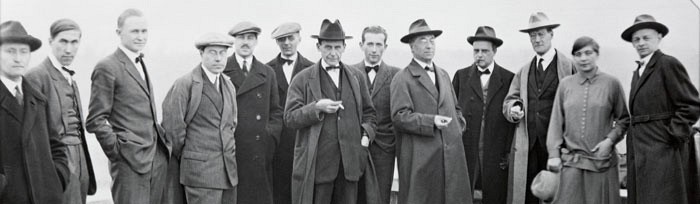
 Fire at Full Moon, 1933
 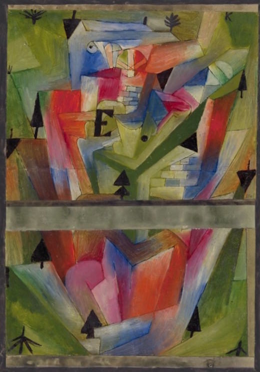 Paysage près de E. (en Bavière), 1921
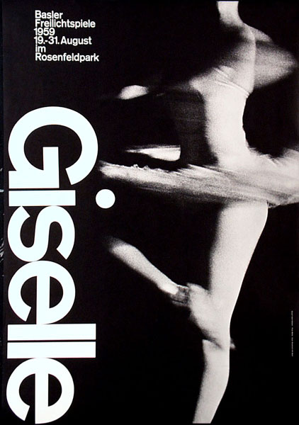
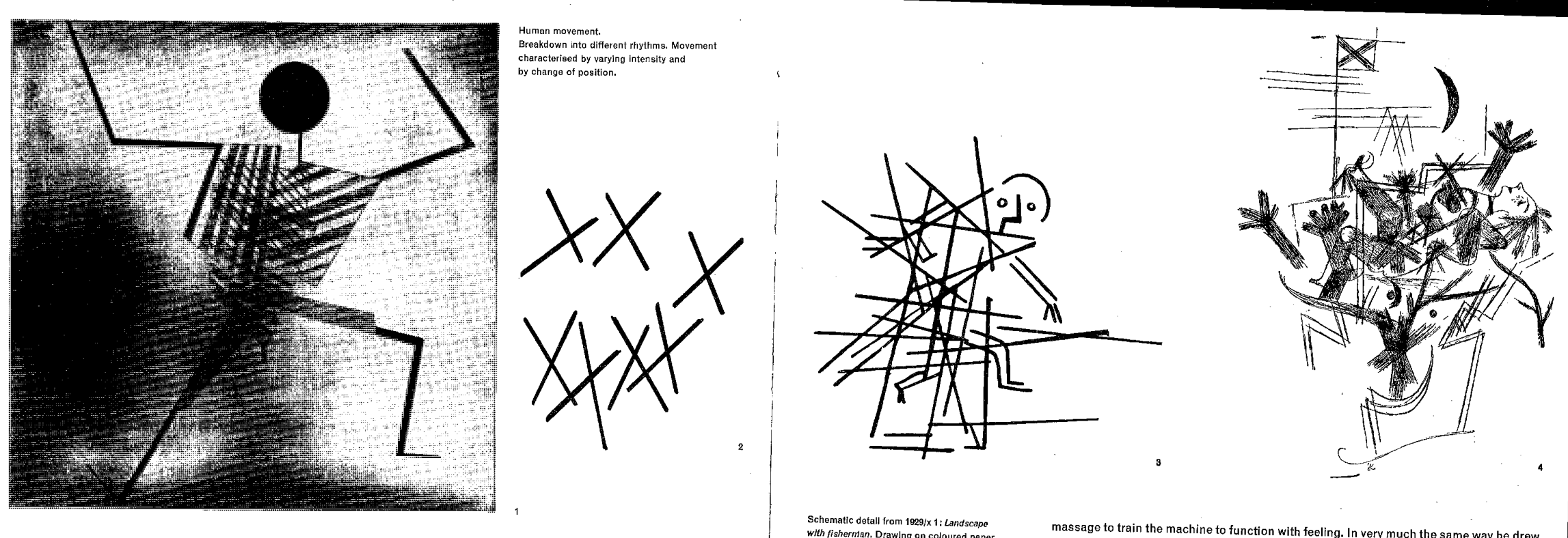 distillation of dance
 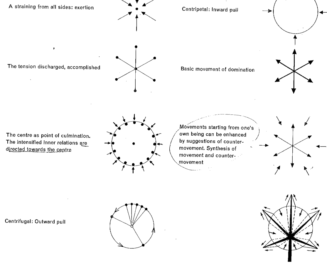 static compositions suggesting energy/movement
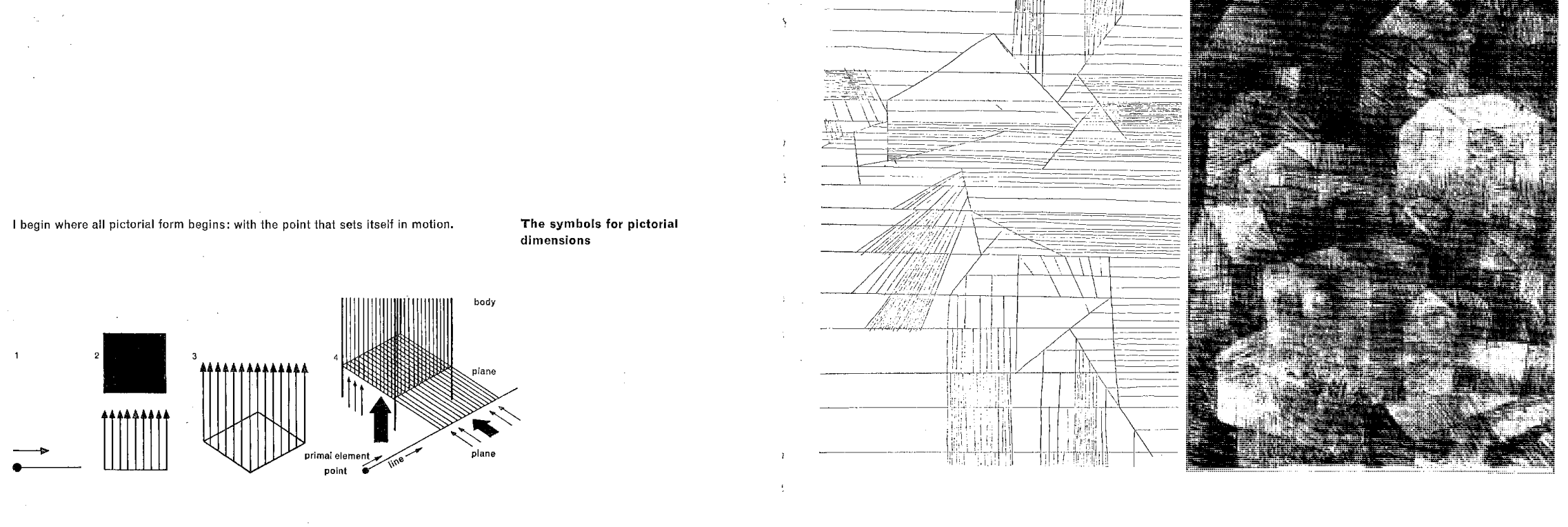 crafting dimensionality


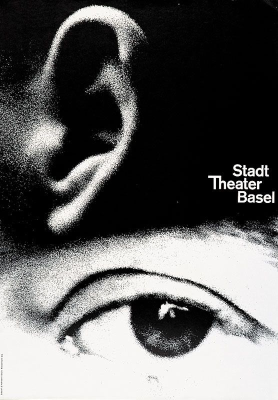 "In a theater poster, he interprets the dramatic experience of watching and listening with mesmerizingly large and grainy photos of an ear and eye, amplifying the impact by reducing the visual idea to its essential components."