Reading #1

Graphesis
by Johanna Drucker

Read the frontmatter and first chapter: Image, Interpretation, and Interface. Also consult the relevant 'plates' in the Windows section.

Pick one of the works cited in the chapter to investigate and collect some imagery and/or context to be included in your write-up. Take your pick of any books/essays/artworks mentioned in the text itself, or highlighted in the red sidebar text in the margins.

Use the tag “R1” for your post.

Reading 1 Assignment

Part I: Brief explaination of G. Spencer Brown's "Laws of Form"
Part II: Outline of Drucker's argument in "Image, Interpretation, and Interface"

Selected Work: "Laws of Form" - G. Spencer Brown

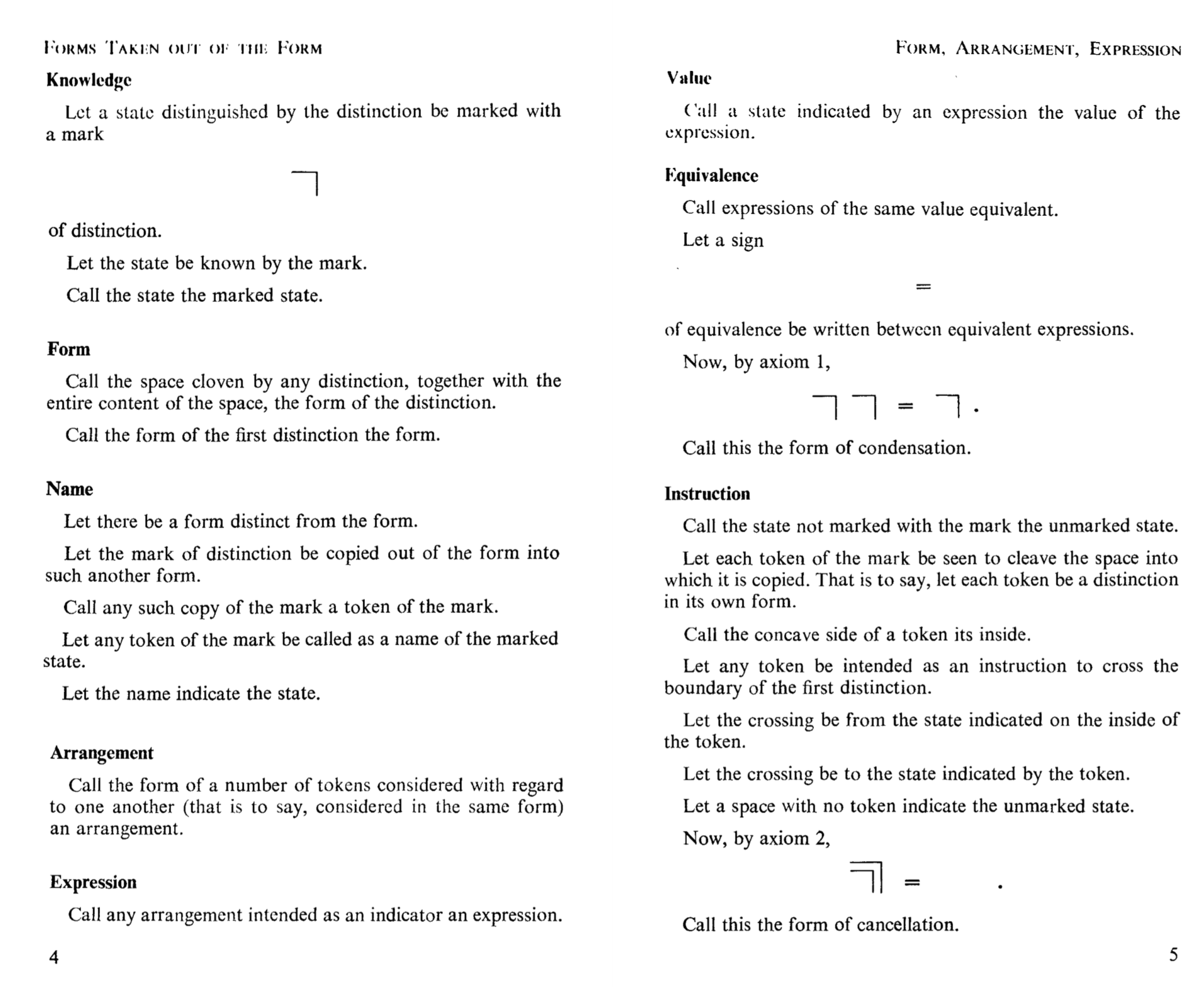
In this treatise, Brown attempts to ellucidate the principles of Boolean algebra using visual elements. He believed that by using visual elements, he could reveal the universal form of logic and mathematics. To do this he recreated a series of proofs using a new graphical notation consisting of compositions of a single symbol. In doing this, he hoped that the obvious form of the argument would be made apparent. The success of such an approach, in my opinion, is unclear as many of the explanations still seem opaque, but I was impressed by his attempt to bring out the beauty and form of formal mathematics.

In discussing Boole's proofs, Brown writes,

"The chief characteristic which has always marked such statements has been an almost total lack of any spontaneous appearance of truth"

Brown describes his method as follows:

"We have a definite system, we name its parts, and we adopt, in many cases, a single symbol to represent each name. In doing this, forms of expression are called inevitably out of the need for them"

Brown begins his series of proofs with the following page laying out his method:

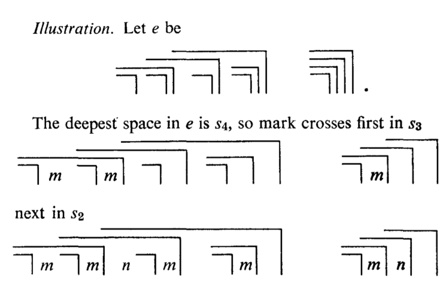
Below is an example of one of the proofs he tried to recreate using this symbol. He was hoping that seeing the argument visually would make the underlying form apparent to the reader.

Image, Interpretation, and Interface

Structure of Drucker's Argument

Knowledge and/as vision:

  • Metaphor "Seeing is Knowing"
  • Effect of available media on the types of knowledge production available (ex: copperplate engravings > lithographs > photographs).
  • Despite widespread use, remain "suspect forms" of knowledge -- not rigorous enough.
  • Architecture and then physiognomy placed as the root for the codification and systemization of visual forms.

Language of Form:

  • Metaphor "Visual Language" with syntax and semantics
  • Historic emphasis is placed on the emergence of production and the necessity of creating consistent reproducible visual elements
  • Systematic and methodological approaches begin for describing and even defining graphical forms (ex: Walter Crane, Eugéne Guillaume).
  • Fine Art: concerned with emotional impacts (some viewed as universal) different graphical forms could have on their viewers(ex: Hubmert de Superville, Charles Blanc).

Dynamics of Form/Universal Principals of Design:

  • Explicit attempts at articulating design principles as a formal language.
  • Emergence of graphic design as a field.
  • The Modern Age > attempts to view visual abstraction as a formal system (with "universal" principles).
  • These mirrored attempts in formal logic and language systems (ex: Frege, Boole, Wittgenstein, Spencer-Brown).
  • Fine Art: also looking for abstracted universal primitives like proportion, harmony and number (ex: Kandinsky, Klee).
  • Arrival of technical manuals and pedagogical materials explaining "visual language" - streamlined discipline (ex: Kepes, Dondis, Swiss school of designers).

Gestalt Principles and Tendencies

  • Move to perception, more psychological/biological approach.
  • Experimental studies on human's universal perceptual tendencies.
  • Perceptual system prefers simple interpretations.

Basic Variables

  • Semioticians looking for codes of visual form.
  • Bertin's seven variables of static graphics.
  • Saint-Martin's "coloreme" - smallest unit of significant meaning production.

Understanding Graphics and Editing

  • Graphic novels and cinema editing - maintain some continuity across frames to aid narrative.
  • Question of whether those principles hold for interfaces as well, which don't necessarily carry the same type of narrative.

Processing Images

  • Artificial vision approaches identified alternate graphical primitives (ex: Cohen, Marr).

Typology of Graphic Forms

  • Formal methods may have reached a limit at expressing humanistic representations - perhaps need a different approach now.
  • "When graphical languages engage with poetics and rhetoric, we will have arrived at a fully humanistic system for visualizing interpretation.

Write-up

With this introductory section of the book, Drucker aims to clearly layout the chronological development of an image to an interpretation and then to an interface. Balancing art; which focused on aesthetics, and design; which focused on function, Graphesis is the middle ground. Dividing the chapter into main parts clearly traces the development of an image from the Middle Ages to an updatable interface in the recent years. As a graphic designer, the reading linked to personal steps of the designing process. As the author explained each step, the mapping of designing a product aligned. Agreeing with most of her steps, the first chapter clearly set up the basis for the rest of the book. I wonder of other people in the class linked these steps when they create forms.

It was believed that the key to unlocking the universe in the Middle Ages was to make a close replica of the form found in nature. The more we understood by observing the more we can produce these forms. However, there is knowledge that exceeds visual representation, such as an idea. Another example mentioned the difference between Humanistic Knowledge and Mathematical Knowledge. It was understood that these two types never intertwined with each other. Drucker later gives examples of architecture which uses style and math and physiognomy which uses drawing and divisions. Through this mindset, the author traces us into the form of production. Specifically, focusing on the translation from forms created by hand into forms produced by machines. According to Humbert de Superville, there was a need to reform techniques of art into a new industry that can be easily produced. This is where the focus on geometry came into play. Focusing on how lines and color can have an emotional impact on society was the main focus; Asymmetry, fluidity, movement, dynamism, solidity, balance, proportion, and harmony. The author explains that design was not only pictorial but a language needed to be adopted. With this, understanding the patterns within similar forms and the meaning of the existence of each linked to grouping them as well. These forms have developed more into a “language.” Later on, she explains the concept behind a third meaning which was the transition between images and not the images themselves. At the end of the chapter, she explains how these languages now must interact as an interface that responds to the user. From a simple first step of observation develop into complex representations that interact directly with the user and link to their own cultural training.

These steps are crucial to the understanding how we send and receive messages in our work. I'm personally looking forward to a chapter on the difference in culture when a form is processed and how it affects the main message.

The Bases of Design by Walter Green

alt

Drucker's comprehensive introduction to the theories and formal design systems through history showcased the driving forces of universality, principles of composition, and industry need as primary influences. At the precipice of a turning point in history where we are experiencing (or soon to be) driverless cars, artificial intelligence, internet of things and connected devices in our every day lives- one can't help but consider if our current design systems and standards are prepared to handle not just the evolution into such terrain, but the sustainability of such ambitious endeavors.

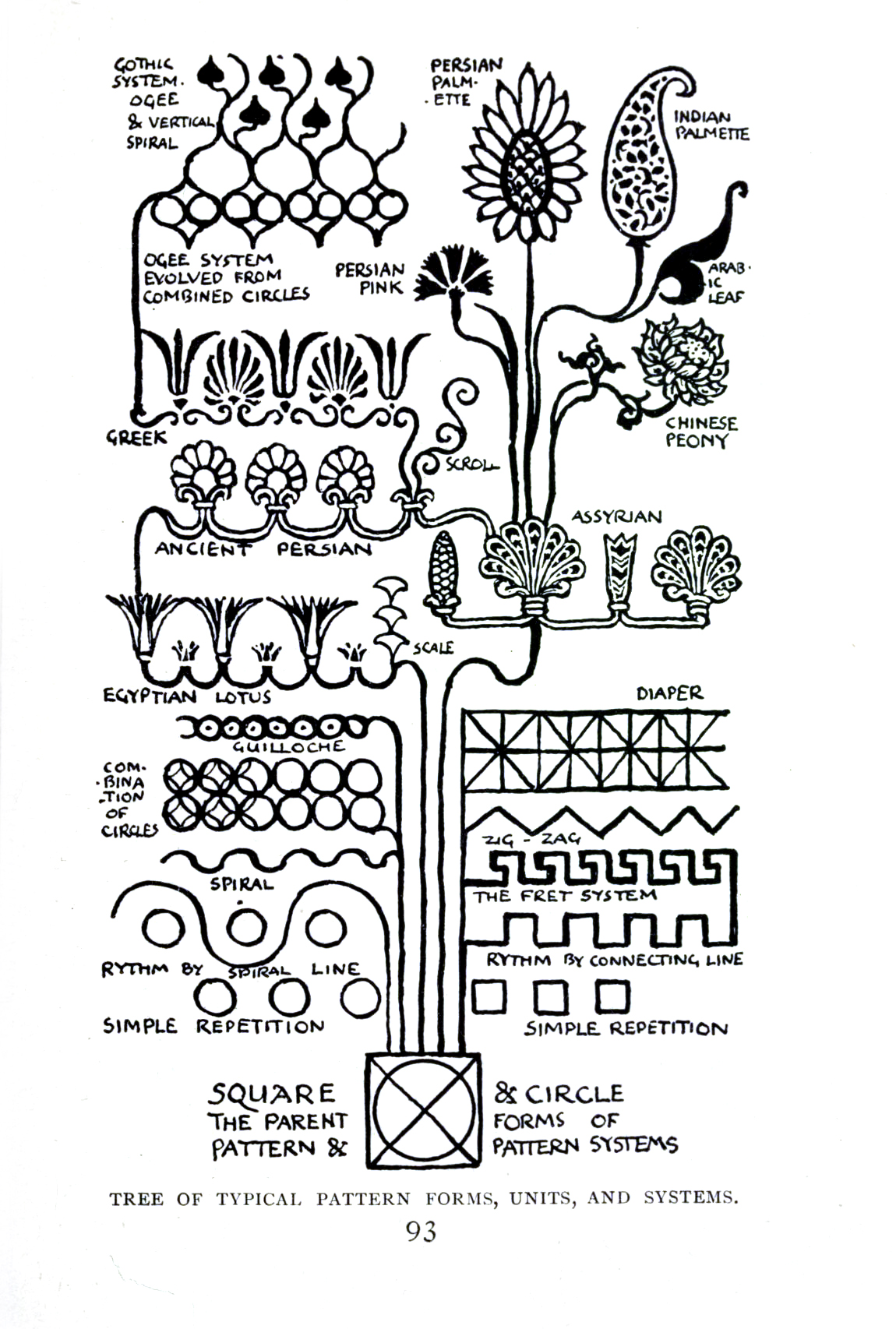
Walter Crane's "Line and Form"*, according to Drucker, was meant to "train the eye and mind at the same time, providing cultural references and analyses as well as formal means for production." In another sense, Crane was evolving the graphical forms of visual elements in preparation for physical application. "Crane explained in Line & Form, that the shape of a fruit would in turn decide the shape of the leaves surrounding it and the shape of the stem and tree holding it." The evolution of this synthesis stems from the basic elements of the circle and square from which all others evolve. In the grand scheme of things, it doesn't seem simpler than that, yet often times bad design is to blame for the failure of new and emerging technologies.

Drucker's introduction to the various ways in which design adapted to industry need, has me interested to explore further what design systems of today are poised to lead us into the next century, and what makes a design system successful for sustainability. Is it simply that at its basic form it follows principles of composition and form that relate back to the alpha omega parents, circle and square, that Crane so simplistically presented as explanation?

Modern design systems and standards will need to be adapted for a multitude of mediums to accommodate interpretation at both the individual level, and the collective. As we incorporate more digital technological experiences into our lives and industries, so too will this move into the physical spaces we occupy and transverse, whether tangibly or by means of increasing augmented and virtual reality experiences. Consistency of those designs systems to flow visually without introduction nor explanation from space to space will be an integral part of adaptation and evolution.

Drucker's journey through visual graphic practice, design theory and systems evolution leaves us with the notion that "the book of the future won't be a book at all, it will be a multi-sensory multidisciplinary, evolving mechanism that we experience as a myriad of senses and via multiple mediums."

Questions

  1. Visual graphic standards attempt to create universal interpretation and understanding regardless of cultural reference, language, and a myriad of other intangible differences. What would the universal icon for translate look like? Does one already exist, and how do we apply it to not just web-based experiences, but adapt it- and any notion of a universal design system- to fit the ever increasing merged experiences like augmented and virtual reality?

  2. If we truly "know that the affordances of our senses and the capacities of cognition together construct the impression of the visual world", can we successfully design anything without imparting inherent meaning and symbolism?

  3. Are the circle and square still deemed the alpha and omega of today's visual design systems as Crane proposed, or does another pair now exist? Would we consider the programming elements, "0" and "1"?


*While I chose to reference this source, I could not help but note the way in which Drucker described this work specifically with high praise > remarkable, exemplary, masterful, superb, dynamic, gifted > were all words to describe Crane in the space of two paragraphs. I couldn't help but note that perhaps Drucker's own unconscious bias rubbed off on my interpretation of some of the relevance of the work.

I was particularly struck by Drucker's discussion of the formal systemization of the visual arts (pg 25), as aesthetics and methodology may seem idiosyncratic processes.

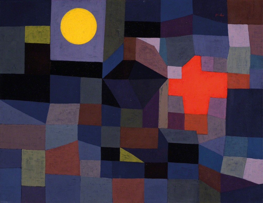
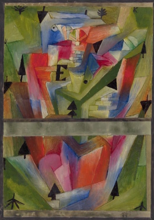
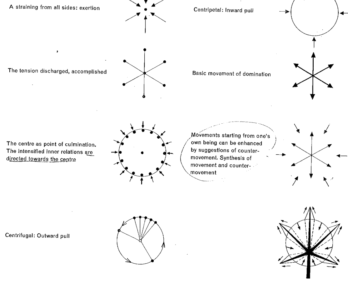
Drucker cites Paul Klee as one of the early twentieth century visual artists championing universal forms and a methodology to visual making. For Klee—father of abstraction and teacher at the Bauhaus—the process of representation outweighed the object represented.

Fire at Full Moon, 1933

Paysage près de E. (en Bavière), 1921

"I should like to create an order from feeling, and going still further, from motion." Paul Klee

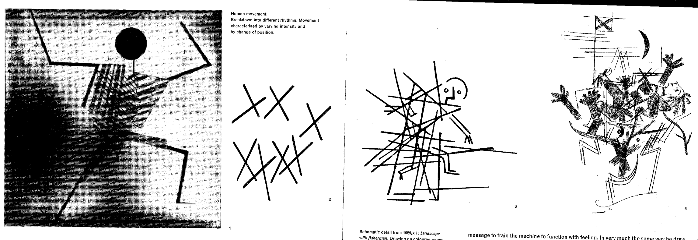
Klee's drawings in The Thinking Eye use pure form (vs pictorial representations) to evoke, excite, and allude to dimensionality, directionality, and dynamism.

distillation of dance
abstraction of human movement

static compositions suggesting energy/movement

crafting dimensionality

In this first chapter, Drucker provides a survey that demonstrates the evolution and emergence of graphics as a means of communicating, representing, and producing information. Doing this chronologically, she begins by detailing a problem central throughout the chapter — that graphics historically (and even today, to a lesser extent) were not organized by an overarching “language,” by which she means that they did not follow a systemized grammar of syntax and semantics. In this vein, she describes historical reservations to using visuals as a form of knowledge communication, paraphrasing the sixteenth-century mathematician René Thom as noting explicitly that “visual codes are notoriously unstable, too imprecise to communicate knowledge with certainty” (23).

She dismisses this idea, however, that graphics cannot be an effective method of communication, first by noting that throughout history visuals have been used as a means of communicating knowledge, often when other methods were insufficient. She then, through the rest of the chapter, goes on to describe different attempts at creating a “language” of graphics. Towards this end, she begins by discussing the nineteenth-century early attempts at creating organized guidelines for graphics to be used in engineering and other industries. From this she explains how Design emerged as a separate discipline from the visual arts, primarily concerned with constructing graphics that, based on these emerging guidelines, had a primary purpose of communicating information.

Drucker goes on to describe the various attempts at creating this graphical “language,” mentioning that many of the graphical principles we take for granted today were only developed starting in the mid-20th century. After surveying these various methods of classifying visuals, she begins discussing video and interactive interfaces, concluding by introducing the topic of the remainder of the book: an analysis of the components that make up interfaces and information visualizations.

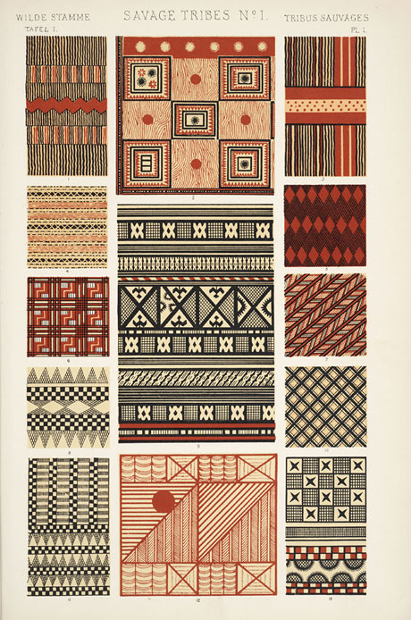
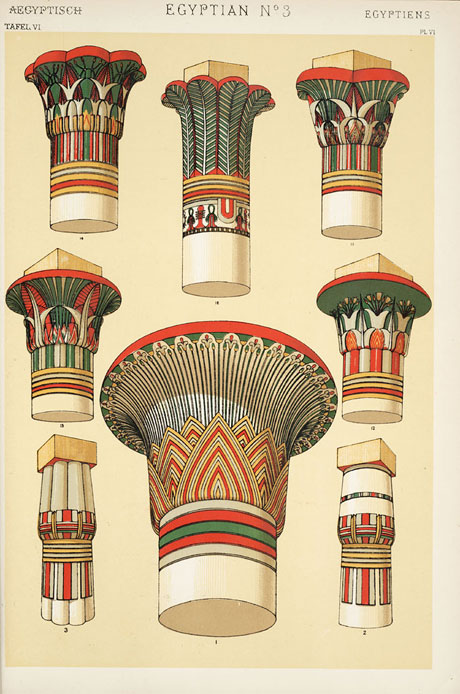
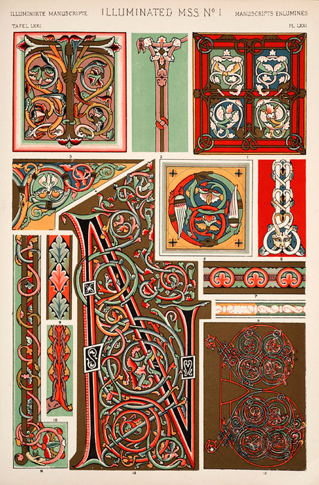
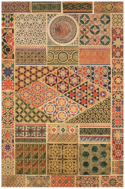
I decided to look a bit more into Owen Jones’ 1856 The Grammar of Ornament, which was the encyclopedia of different graphic motifs. Given its time of publication, it is clear why this work is so important, even without considering its massive scope. As Drucker mentions, there was not much of an organizational system for graphics at this time, let alone attempts at creating a set of graphics principles. This seems to be one of the first attempts at organizing graphics, and though the work only catalogs and does not outline explicit graphics principles, the organizational structure makes such hidden principles easier to see and to outline. Some example pages (from www.thegrammarofornament.com) are:

The range of the collection can somewhat be seen in these examples with graphics varying from "Savage Tribes" to "Egyptians" to western "Illuminated Manuscripts."

In the first chapter of Graphesis, Johanna Drucker presents us a thorough introduction to the realm of "visual epistemology" by exploring its history and developments. The main objective of this chapter, I think, was to present us a landscape of how visual representations have been transformed and influenced by the work of different actors across multiple disciplines, in order to create universal frameworks or standards that should be followed in a particular domain in a given time.

The study of the visual production of knowledge is not as advanced and universal as other disciplines have achieved in their own stages (linguistics or mathematics). This is particularly worrisome given the fact that we find ourselves living at a time when we are being bombarded with images that structure and define our relation to knowledge.

It becomes even more important for those of us that have a humanities background where we favor linguistics over graphic representations of knowledge. That being said, it represents a challenge to develop a visual language to interpret and present many of the interactions that are being studied by the humanities and social sciences. The author seems to agree by mentioning some concepts like the "workings of power", the "force of ideology", or the "transmission of values".

If "we no longer believe that everything that can be known can be seen", how can we even begin to think of a possible visual representation of say the dynamics and forces that corrupt our political institutions?

Nevertheless, the author states that there is an endless stream of visualizations that turn complex phenomena into images, and so, she presents us with the following graph by Philipp Steinweber and Andreas Koller, where they attempt to "open up a new perspective at the topics religion and faith by visualizing the Holy Books of five world religions"1:

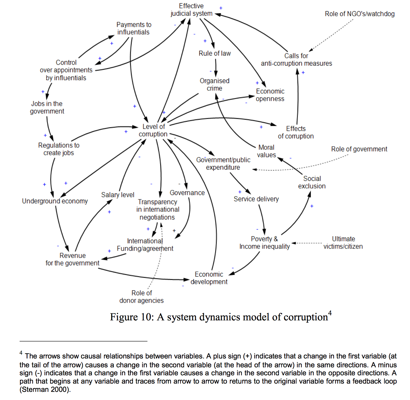
Following this example I decided to look for any attempts that aim to represent visually the "workings of power", with a focus on corruption dynamics:

In this example, Muhammad Aman Ullah and Tiru Arthanari, researches from the University of Auckland, New Zealand provide us with a system of dynamics modelling that allows us to discover ‘hidden’ dynamics of corruption.

  1. Similar Diversity Project: http://similardiversity.net/project/

In the first chapter of Graphesis, Johanna Drucker does an excellent job of creating a timeline of innovations in the field of what she terms “visual epistemology,” or (as on p.11) “an alternative history of images produces primarily to serve as expressions of knowledge.” By pulling from examples stretching over time, from roughly the Englightment period to the present day, and from disparate disciplines, Drucker lays out a thesis of an increasing level of systematization and complexity in information graphics over time. Her primary goal for the book seems to be to foster a greater understanding of the ways that information graphics have contributed to the humanities over time and provide readers with a set of reference points for further contributing to the visual humanistic realm.

Though the depth of her references across fields including Art History and Psychology is impressive, the reader is left with a somewhat piecemeal and Eurocentric vision of the field. Due to the brevity with which Drucker addresses a wide range of sources, this is perhaps to be expected. One point of contention I took was the way in which she exclusively created her timeline around European and American sources. While this is most likely a limitation of her knowledge base (and potential language difficulties), sources such as the Grammar of Ornament by Owen Jones (cited p.27) clearly seek to draw inspiration from non-western traditions for the creation of a larger compendium of visual pattern. Drucker’s analysis largely elides this point. When she does address this problem directly toward the end of the chapter, her framing of the issue suddenly shifts: where her historical sources as well as her project all have a distinct Structuralist undertone, she suddenly adopts a more Post-Structuralist conception of the cultural specificity of form: “Our examples draw on long-standing conventions in Western culture and representation… But other graphical modes are culturally or historically specific…” (p.53). For having spent a significant amount of scholarly energy articulating “epistemological eras” and providing detailed, if brief, context throughout the text, this stance feels like a dodge of the issue.

Citation: 33 (page 35):

Walter Gropius and the Bauhaus movement:

The Bauhaus was founded in 1919 in the city of Weimar by German architect Walter Gropius. The group sought to bring a unity in the arts as reflected in the material world: through furniture design, product design, architecture and graphic design. This vision was laid out in the “Proclamation of the Bauhaus.” Drucker almost certainly cites Gropius as an influence on Kandinsky, Paul Klee and Laslo Moholy-Nagy for two reasons. First: that all of these artists were involved to varying degrees with the design education program that the Bauhaus developed (Klee and Kandinsky both taught the preliminary course for students in color theory and material relationships; Moholy-Nagy oversaw the typography program). Secondly: the approach that Gropius and other Bauhaus members advocated of radical universalism in the arts is clearly related to the later stages of their respective projects, and indeed Drucker’s interest in the two as thinkers. This breaking down of the distinctions between the fine and applied arts, combined with a turn toward flatness, abstraction, and grid-based design patterns, set a clear antecedent for later developments in the field of Graphic Design and aided in its professionalization in the early 20th Century.

Bauhaus Photo Archive

Additional sources:
http://www.metmuseum.org/toah/hd/bauh/hd_bauh.htm

It is interesting to continue to circle the objectivity/subjectivity of a graphics meaning. "Most information visuals are acts of interpretations masquerading as presentation." This highlights the importance of Jacques Bertin's "Semiology of Graphics" establishing a universal graphic language, defining the characteristics that appeal universally to the human eye.

This brings into question the nature versus nurture aspect of our perception of graphics. Which of the gestalt principles are inherited from years of schooling and which are relics of an evolutionary bias? If every visualization is an interpretation and even raw data is viewed through the lens of one's own bias, what should be the guiding principles of conveying information?

A couple references popped into my head as I was reading the chapter. Bobby McFerrin demonstrating our innate ability to perceive and predict the pentatonic scale:

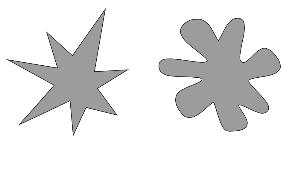
The Bouba Kiki Effect, where humans regardless of upbringing associate softer rounder shapes with "B" sounds and harsher sounds like "K" with angled, pointy shapes.

Accompanying the imagery from 'The Grammar of Ornament' by Owen jones a theory for the patterns of a civilization being shaped by their relationship with the land is mentioned. The idea seems inescapable, that evolutionary human and physical traits of the world we live in have embedded a form of synesthesia that sways our perception of otherwise unassociated shapes.

"Montage is based on third meaning, what occurs across images rather than what is simply within them."

Coming from a film background I wonder the role of montage will play in interactivity for visualizations. The choice to show one data set first, or allow the user to rearrange a visualization carries the ability to fundamentally restructure the meaning of the data being shown.

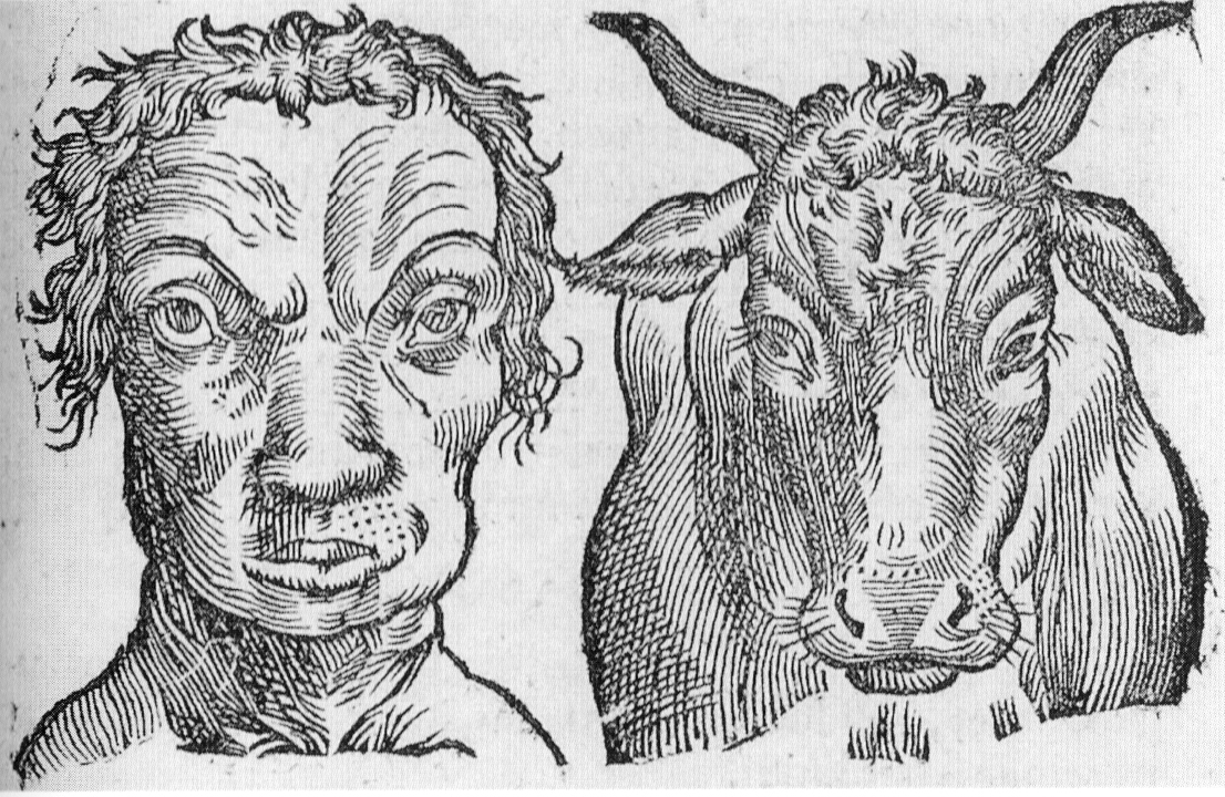
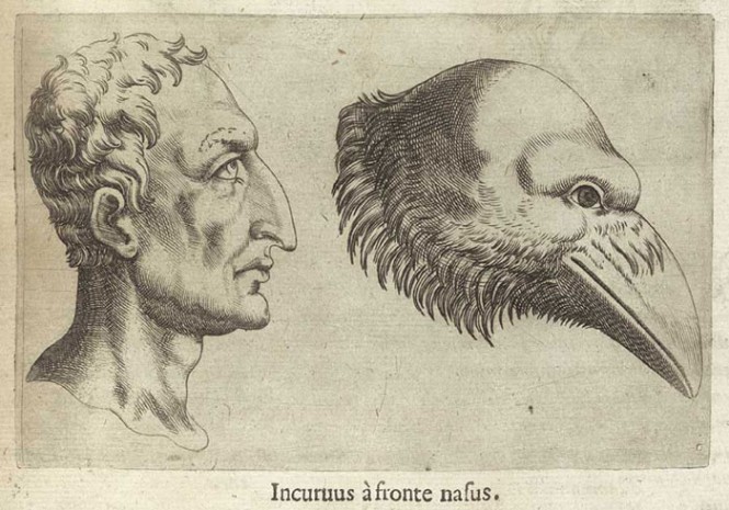
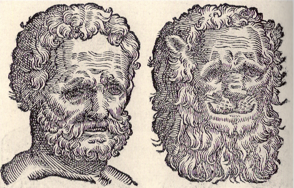
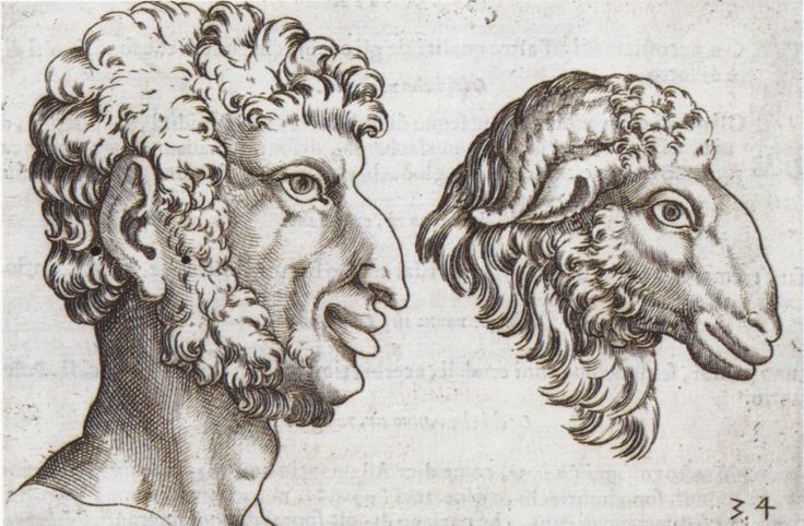
I found some of the references to early attempts of graphic classification pretty hilarious, De Humana Physiognomonia - Giambattista Della Porta attempt to depict associations between human personalities, facial types and animals caught my eye:

In the overview and first chapter of Graphesis, Johanna Drucker defines her title subject as "the study of visual production of knowledge." She describes this as a field still very much in its infancy compared to say linguistics or mathematics, and is the product of multiple disciplines converging. While certain disciplines enjoy maturity such as graphic design or statistical graphics, Drucker is making a point that the humanities has not begun to reach or even fathom its potential using visual knowledge systems. Thus where "interpretation", "ambiguity", and "qualitative judgement" are present, humans have favored & trusted existing forms (mostly linguistic) over graphical ones.

A review of historical developments show how progress has some progress has been made in different disciplines. For example, architecture and physiognomy have developed visual forms. Together with advances in physical sciences and studies of fine arts, "visual languages" have emerged, becoming codified in guides and manuals, many in attempts to define "universal" principles.

Drucker writes that many of these guides are meant to codify methods of production, which for example led to modern graphic design and mass market publications and advertising. As developments in understanding of human vision and perception evolved, principles like Gestalt were defined. Drucker notes this is rooted in a modern desire to identify universal principles that apply in all cultural circumstances. So the biggest advances so far made to date that will support "graphesis" in the future have been thus far rooted in placing high values on objectivity and repetition of production.

In the age of computers and the web, information visualization continues to use familiar forms (charts, diagrams, etc.) . I think Drucker makes a fair argument that "presentation of facts" still is taking precedence over attempts at representing other concepts & ideas. Her list of these concepts on page 22 ("Workings of Power", "Force of ideology", "transmission of values") seems like a challenge to those who wish to communicate about such topics.

Disagreement: Page 24 - "visual images are not governed by principles in which a finite set of components is combined in accord with stable fixed and finite rules." If the statement is "all images" than yes, but what about something like Wilikinson's Grammar of Graphics, which became the foundation of R's ggplot2, which would seem to exactly fit the definition of what Drucker describes?

Points of concern for discussion:

       1.   Drucker uses "humanistic" without defining the term. What is meant by "serving a humanistic agenda"? That could have several interpretations. Is it traditional arts & letters? Or perhaps a simple reference to "human wants and needs"? Or something else?

       2.   What is meant by "And, or Not carry an almost infinite number of qualifying attributes that make each instance distinct." (page 54-55) This sentence is confusing.

       3.   Drucker states an objective to "De-nautralize the interface that has become so habitual in daily use" Is this a reference to graphical user interfaces referenced a page earlier? And is this a call to end interfaces all together or simply replace them?

Additional context choice:

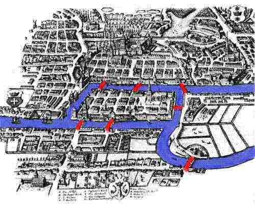
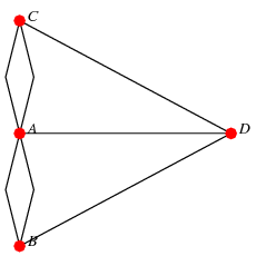
I chose Leonhard Euler's and Stephen Wolfram's drawings of the Konigsberg Bridge problem. (Page 54-55 of Graphesis). I think there are three additional contexts that are worthy of mentioning, not in Drucker's text:

1) The problem statement - how does one design a walk around Konigsberg crossing each bridge only once, with no doubling back & ending where the journey began? The additional view of the city provides this context.

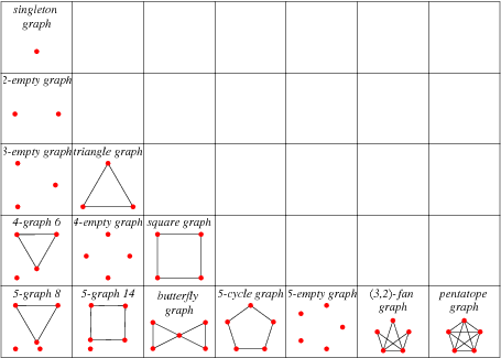
2) Development of theory & language to solve similar problems: As Drucker notes, existing language could not describe the problem or its solution adequately. Euler's solution was the early forerunner of Graph Theory. Graph theory began as a way of recognizing problems as being spatial in nature, and identifying relationships between objects. This image show additional representation of the Konigsberg Bridge problem more abstractly using points, lines, arrows, and labeling. [insert graph view]. Graph theory has its own set of vocabulary ("edges", "verticies", "nodes", etc.).

2.1 Multigraph "re-statement" of original problem:

2.2 [Eulerian graphs]:(http://http://mathworld.wolfram.com/EulerianGraph.html)


3. Additional example uses of graph theory, more closely related to the original bridge problem: Explaining "Lattice formed by atoms in a crystal or the hexagonal lattice made by bees in a beehive" to "finding a way to escape from a maze or labyrinth". Full article here.

Overview:
One of science's most ambitious projects started mid last century.  Practitioners wanted to create a single model of the universe. This transformation of the "Grand Unification Theory" into the "Theory of Everything" has proved illusive.  To this day, scientists evince a greater capacity to formalize new models than to create a single formalization applicable to all phenomena.  Does this lack of achievement in any way suggest that the original problem articulation or utility are in any way diminished in value?  No. Similarly, this is where Graphesis excels. Unfortunately this is also where the two inquiries diverge, but more on that later.

Drucker asserts rightly that her readers are deluged with a "ubiquity of graphical formats".   Of these, there is a subdomain that creates rhetorical arguments and/or convey knowledge.  Although we can all interact with these instances, our interactions are largely founded on cultural intuition.  This is so because the visual form is regarded with "skepticism" and "distrust" by industry and science for the ambiguity of the visual.

The net effect is that, to the degree that they encode a rhetorical argument, their function has been rendered invisible largely, but not always, due to some path-dependency and/or other urgent cultural, industrial, or scientific requirement.

This needs to change yesterday. We have to create a new unified way to critique and understand visual arguments.  Moreover, this process needs to be done as consciously, conscientiously, and with the same cultural import as similar processes using words or numbers.  Unless this is done, we will continue to stagnate in the existing domain-specific partial solutions elaborated on in this chapter.

As a preface to the exhaustive list of historical examples, Drucker outlines the qualities she expects such a formalism would possess (pp20). Her endgame as expressed here is then not only be a set of formalisms for understanding visual rhetoric but also a clarification of how they would be applicable to "humanistic problems of interpretation".

Thoughts:
The goal articulated, we can return to my example in the first paragraph.  Similar goals have been expressed in several domains of human endeavor throughout the centuries.  I am not aware of one that has actually succeeded without any major caveats.  To a degree, the success of these sorts of projects is irrelevant.  The critiques, formalisms, and directions that they generate have value regardless of whether the end goal, as initially expressed, is actually achieved.

That said, I found Drucker's goals, when they implied going beyond critique and formalization, unclear and at times, lacking in scope.  

She asserts unambiguously that we need to create a visual epistemology and that she will use visual approaches to knowledge production as the foundation for her theoretical and methodological foundation.  Other times she seems to state that the goal is a formalism of meaning producing graphic forms (pp17 2nd ph 2nd sentence) .  While I would support the latter, the former is contextually problematic and to be clear a formalized ability to create and critique visual rhetoric does not constitute a knowledge-producing epistemology.

Throughout the first chapter Drucker repeated the truism that semiotics is contingent on and co-constitutive with its embedded culture. Drawing from her examples, I would expect that any project whose goal is to articulate and formalize a new domain of knowledge production might open with an academically rigorous salvo of precedents.  While her tone is hardly conversational, it was not clear how the deluge of examples formed an effective narrative argument.  While almost always interesting, her path seemed winding and unconvincingly inductive.

On this point, the vast majority of her examples were eurocentric. As Drucker would surely attest, there are different ways of encoding knowledge.   Her choice of precedents here seems to imply that she is content with re-committing the historical sins of the sciences and humanities. Or perhaps, in the best case, she can pursue this goal strictly for eurocentric ends, and let other cultures adapt such work later.  Either way, history suggests it won't end well.

Work:
When I first read this chapter over the summer I was able to relate most to her examples that drew from my work as a coder.  That said, in the countless openframeworks or processing examples which I have made for my students and in the equally numerous finals and midterms they would submit, I never quite regarded them so consciously as a visual rhetoric.  This is an idea I find fascinating and hope to continue developing.

From the website Processing styles itself as an open source, "software sketchbook", that allows anyone to create interactive 2d and 3d works more easily than using using various frameworks directly.

Questions:

From the last page of the preface she asserts it is possible to: "encode knowledge as interpretation" While not orthogonal, these activities seem separate enough that I can't parse the meaning here.

In all examples I could find independent of the book, a visual epistemology has more to do with embedding knowledge in graphic forms. What is an example where knowledge is produced by these forms?

Why would she focus on the applicability to "humanistic interpretation"? Would she say a formalism has already been produced for science and industry?

With regards to "the right tool for the right job", what if math is more generalizable because of (arguably) the lesser degree to which it owes its utility to cultural interpretation? The follow on here is that visual forms will never enjoy the same formalism since they are highly dependent on the culture in which they exist?
The predominant concern of this first chapter in Dr. Drucker’s work is an inquiry into a potential formalisation of the manifold techniques, concepts, and elements of visual forms as a whole. The metaphor of “language as a formal system” undergirds Drucker’s progression through the history of graphic design, her attention focused most clearly on the ways that “systematic use of visual images [create] standards and consensus”, with formalised rules employed to codify information visually (24-26).

And from a historical and cultural context, Dr. Drucker provides a reasonably comprehensive account of the manifold attempts at the formalisation of a language for graphic design. The history presented clearly maps out an evolving and developing body of understanding of what such a metalanguage necessitates, in terms of universal formal principles and tenets to be espoused within a systematic approach to theory (29, 31, 35).

Where I find myself most uncertain with regards to this reading, and where I’m most interested in hearing from my classmates with formal backgrounds in design, are the passages in which Dr. Drucker most directly ties this pursuit of a formalisation of graphics to the explicit definitions of formal systems. At these certain points, she fully extends the central metaphor of a graphical “language” into a literal comparison with the concepts of syntax and semantics of such a logical calculus.

Dr. Drucker first draws a direct connection between certain terms and principles of graphic design with semantic and syntactic function, and when later regarding Owen Jones, she characterises his The Grammar of Ornament as displaying these syntactic and semantic modes in its “continuous…repeated units and patterns” and in its “iconographic elements [and] figures”, respectively.

The question which most interests me is that of how closely does the metalanguage provisioned by Dr. Drucker’s account hew to formal languages in actuality? I am unconvinced, or at least uncertain, of the correlate between the codification of graphic design to formal grammar/syntactical structures, and operational dynamic semantics, of functional, logical, and computational languages?

alt

Post Image: Owen Jones, The Grammar of Ornament - "Byzantine No. 3"'

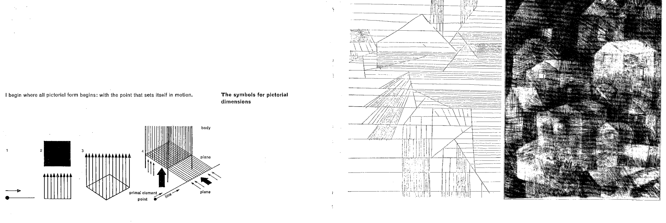
"Point and Line to Plane" by Wassily Kandinsky

Joanna Drucker starts off her book Graphesis with an exploration into "Image, Interpretation, and Interface".

In this reading, I was particularly tickled by the following question: Can we imagine a "pure" theory of graphical notation and behavior"?

To investigate, I dove into further research into Wassily Kandinsky's Point and and Line to Plane (1926), referenced on page 35 following Kandinsky's 1910 essay Concerning the Spiritual in Art.

The video below illustrates three major points that stood out to me:
• The movement from point and line to plane focuses on the behavior of circles, rectangles and triangles
• According to Kandinsky, angles can insinuate sounds! A "sharp and highly active" for acute, "coldest and most controlled" for right angles, "weak and passive" for obtuse
• Drama can be created through tension of pure forms and their positions. For example, Kandinsky offers that as elements move closer to the boundaries, they become more tense and more "free" towards the center of the plane

Image, Interpretation, and Interface Write-Up
Ryan Best

In Image, Interpretation, and Interface, the first chapter of Graphesis, Johanna Drucker offers a broad-sweeping introduction to the origin, history, and development of “visual epistemology”; in layman’s terms, how graphic and visual work has developed core structures, standards, and principles that aid their use in providing interpretation or analysis across a wide range of disciplines. Drucker also focuses on explaining graphics in the context of a well established “language of graphics” metaphor. This metaphor grounds the chapter's conversation on how thought leaders established and expanded formal articulations and consensus regarding graphical representation of knowledge in a way that allowed for fluency across eras, professions, and disciplines – in a similar fashion to how rules of grammar and syntax allow for fluency across speakers of a common language - and how this metaphor has been used by thought leaders to communicate these findings to a broader audience.

Most interesting to me in this chapter is how there continued to be an emphasis on standardization and reproducibility in approaches to graphics throughout their development – so much so that even formalized principles rooted in psychology concerning how visual forms produce predicable effects in their audience (Gestalt principles) were defined – and the limitations that coincide with these systematic approaches across times and cultures. Many aspects of these foundations of graphic design – how we communicate and interpret information through visual mediums – have become ubiquitous enough that they can be taken for granted today, and this common understanding allowed for the constant development of new ideas and expansion of this medium into processes that were not inherently visual. It is this aspect of studying how visual communication has evolved over time that most interests me; how standardization and reproducibility has lessened the amount of cognitive lift required to understand and interpret visual representations of knowledge, and how this push towards so-called “graphic formalism” to establish universal repeatable principles of visual forms can add credence and “an air of authority” to the topics being covered (p.34).

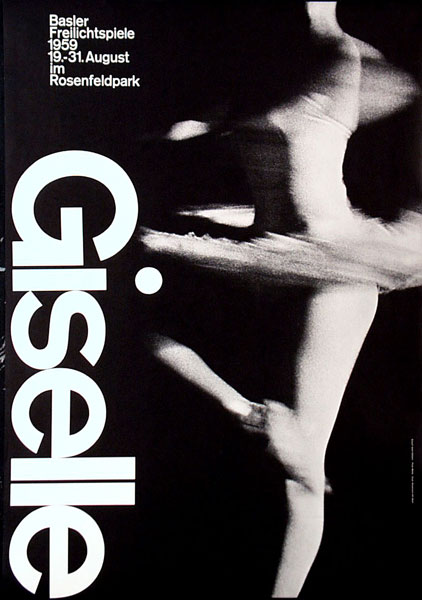
Armin Hofmann
In this vein, I chose to investigate the work of Armin Hofmann, who is mentioned on page 38 – “…Armin Hofmann wrote texts that outlined ‘principles of graphic communication’ and elaborated tenants of formal visualization as compositional principles (size, scale, movement, order, symmetry, asymmetry, etc.)”.

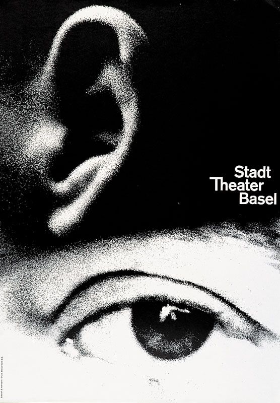
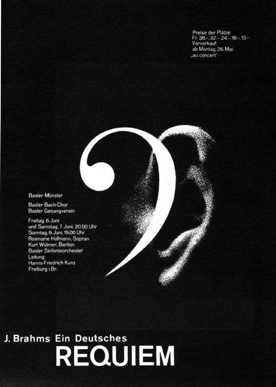
Hofmann, a Swiss designer and professor at the Basel School of Design, approached graphic design from a purely rational and methodical standpoint. Hofmann and the Swiss International Style of design, to which he and his students contributed heavily, sought to establish universal tendencies and styles within design, optimized for communication without sacrificing beauty or aesthetic merit. His book Graphic Design Manual, which outlines these philosphies, has maintained its place as a pivotal resource to designers today in the digital age, expanding past mediums primarily employed by Hofmann at its inception. Hofmann believed in the poster as the most efficient form of communication, and the posters he designed for cultural clients (especially the Basel Stadt Theatre) showcase his purity, simplicity, and elegance in design. This emphasis on clear, reproducible communication of information, knowledge, and feeling in a visual format has truly stood the test of time, and is something that strongly resounds with me.

Poster Designs
"In a theater poster, he interprets the dramatic experience of watching and listening with mesmerizingly large and grainy photos of an ear and eye, amplifying the impact by reducing the visual idea to its essential components."
Sources:

  1. Armin Hofmann : Design Is History

  2. 2011 AIGA Medal: Armin Hofmann

  3. Designers: Armin Hofmann (Pinterest)